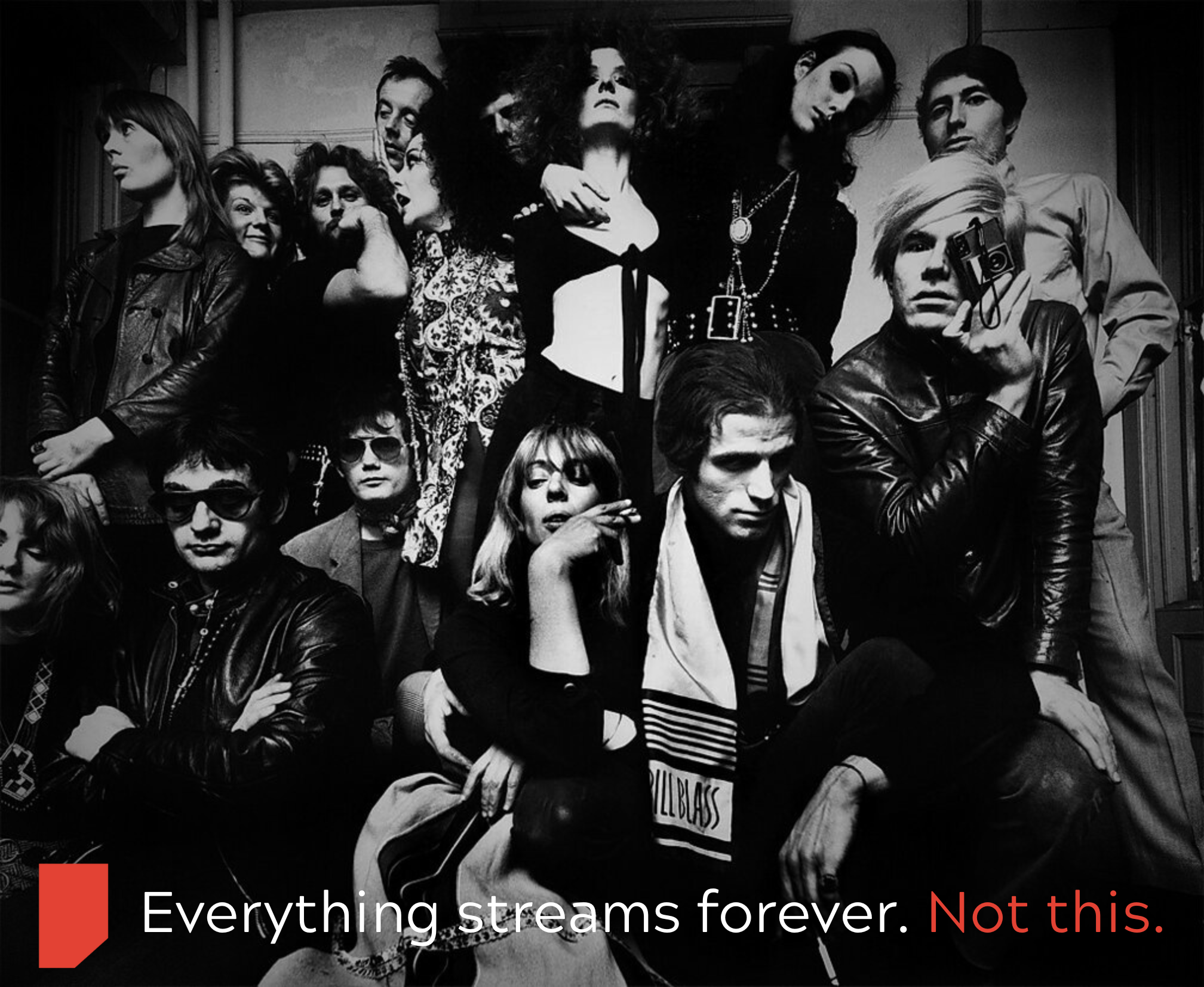
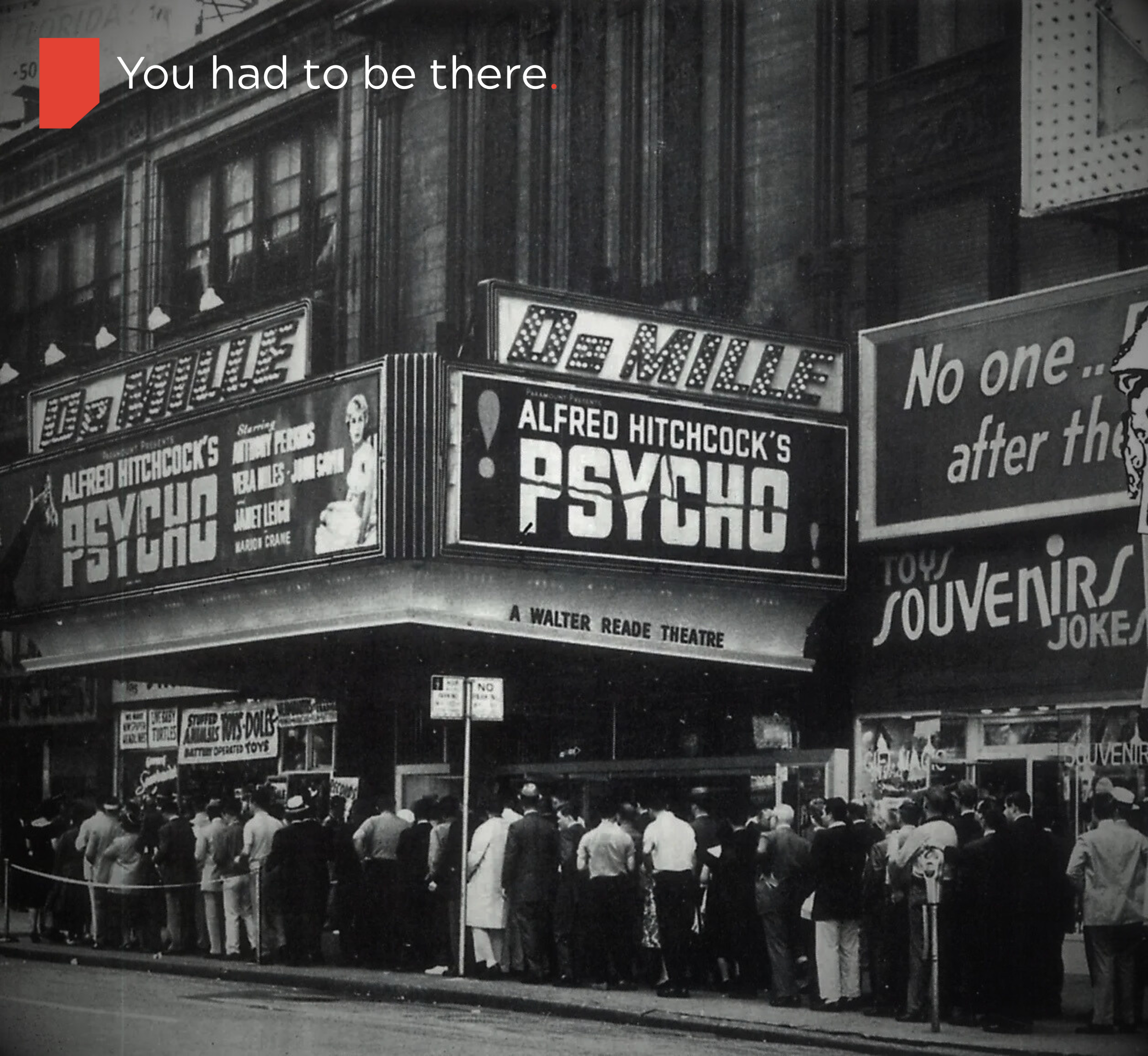
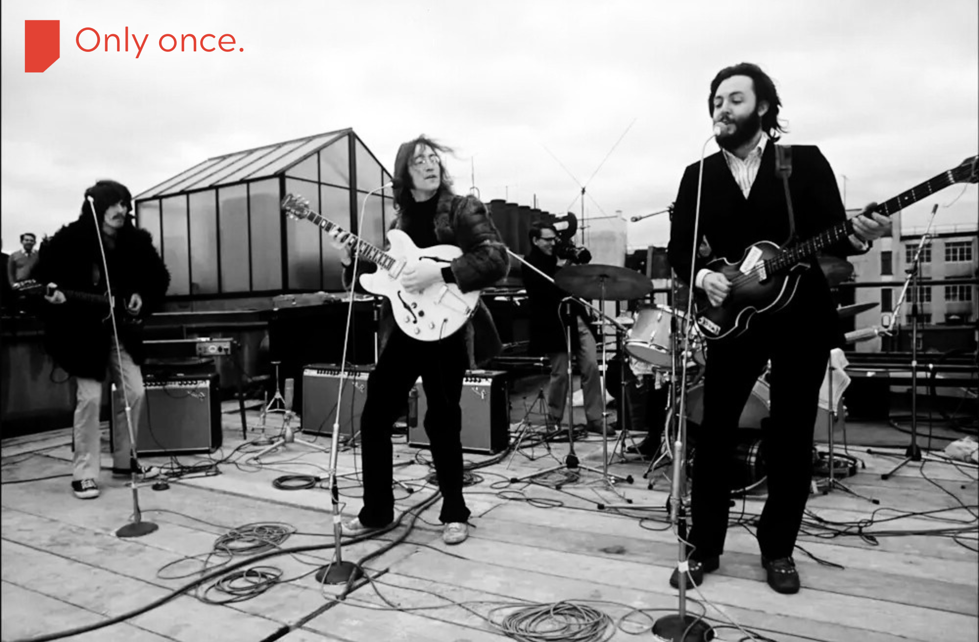
Coterie
A digital premiere house for artists who want their releases to feel like an event, not a content drop. It creates one-time, paid, time-limited experience audiences gather to watch together. Once over, the work becomes unavailable till the artist chooses its next release stage.
Brand Archetype
Coterie is built primarily on The Magician, with a secondary pull from The Creator.
The Magician archetype is about transformation, ritual, and making something intangible feel real. Coterie does not merely distribute work; it changes the state of the work by changing the conditions under which it is experienced. Time, scarcity, and collective presence are not features, they are the spell.
The Creator shows up in how the platform centers the artist’s intent, craft, and authorship, giving them tools to shape not just what they release, but how it enters the world.
Challenge
Streaming has flattened releases into endless scroll, killing the sense of occasion around new work.
Artists are buried inside algorithms, with little control over how their premieres feel or how they monetize them.
Fans have access to everything, yet rarely feel like they were truly there when something important arrived.
The problem is not distribution. It is meaning.
Creative direction
Coterie exists to bring back the ritual of release. Every premiere is treated like an opening night: limited, intentional, and charged with presence. Artists choose how their work appears, who gets in, and what happens after. Fans are not passersby, they are witnesses.
From an archetypal perspective, this is Magician territory: creating a threshold moment where ordinary content becomes an experience, and time itself becomes part of the value.
Visual world
Interface that feels like a gallery: dark or soft neutral base, minimal chrome, strong focus on the work itself.
Typography with quiet authority, mixing a clean grotesk for product UI with a more characterful serif for titles and event posters.
Photography and illustration that feel cinematic and documentary, leaning on grain, shadows, and framing rather than loud color.
Visual cues that signal “event” time: countdown clocks, ticket motifs, subtle light spill effects, and poster-like key visuals for each premiere.
Tone of voice
Calm, confident, and slightly cinematic, speaking to artists and fans like adults, not users.
Prefers precise, concrete language over hype, more “doors open at nine” than “you do not want to miss this.”
Honors the artist by name and craft, never treating their work as disposable content.
Avoids slangy, trend chasing, or algorithm talk. This is about art, time, and presence.
Key Assets
Landing page hero presenting Coterie as a digital theater: one strong line, a single marquee premiere, and a clear “Get your seat” action.
Premiere detail page with poster, synopsis, artist statement, seat count, date, and price, plus simple FAQ on how the event works.
Ticket email and access pass that feel like a real ticket, not just a receipt, with clear instructions and a bit of ceremony.
In-event screen with countdown, player, and a restrained reaction layer, designed to feel like entering a room, not a crowded feed.
Artist dashboard overview where creators can set date, price, capacity, and post-premiere rules in a way that feels empowering, not technical.
Marketing & Growth Approach
Target segments: independent filmmakers, musicians, and multidisciplinary artists who already have some audience but want more control over premieres, plus early adopter fans who value being first and close to the process.
Acquisition channels: direct outreach to artists, partnerships with small labels and film collectives, targeted social around specific premieres, and a strong editorial blog or newsletter telling the stories behind events.
Launch in three phases:
Tease: announce the concept with your own premiere and a small circle of artists, building intrigue around “digital openings.”
Launch: run a short “season” of curated premieres, each with its own poster, social kit, and behind the scenes material.
Sustain: roll out tools so artists can apply to host their own premieres, while continuing to curate flagship events.
Flagship campaign idea: “I Was There First,” a recurring series of premieres where attendees receive a small digital badge or artifact proving they were at the original drop.
Creative reuse: every premiere generates a loop of assets: posters, trailers, quotes from chat, artist commentary, all repurposed across social, email, and the homepage without diluting the event feel.
Testing and learning: experiment with price points, seat limits, event formats, and messaging frames, then standardize what consistently drives attendance, repeat usage, and artist satisfaction.
Systems & Ops
Build a weekly and monthly premiere calendar so artists and fans can see what is coming, with clear windows and no last minute chaos.
Run creative sprints for each premiere: brief, concept, assets, approvals, and post event recap, so the process feels repeatable rather than improvised.
Use a central hub for templates, checklists, and playbooks to keep execution consistent.
Standardize intake forms and artist onboarding so every new premiere starts with the right information about goals, audience, and constraints.
Maintain a living brand system so new designers, marketers, or collaborators can plug in without diluting the visual and narrative integrity.
Archetype Reflection
As a Magician brand, Coterie’s greatest strength is its ability to transform perception: to make digital releases feel rare, meaningful, and shared. Its greatest risk is opacity or pretension.
This is managed by grounding the magic in clear systems, plain language, and practical tools for artists. The Creator archetype keeps the platform honest, ensuring the transformation serves the work, not the spectacle.
Coterie does not promise fame or virality. It promises presence. And it delivers that promise through structure, restraint, and ritual.
Balloon & Pin
A jewelry concept built around a simple idea: the world stretches us thin. Expectations, roles, and appearances pull like a balloon under pressure. Balloon & Pin creates pieces that symbolically pop that tension, reminding the wearer to return to their own shape instead of the one society inflates around them.
Brand Archetype
Balloon & Pin is rooted in the Outlaw archetype, with a quiet undercurrent of the Creator.
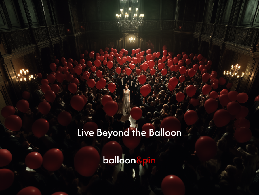
It exists to reject imposed norms around beauty, performance, and identity, not through shock or aggression, but through refusal. The brand does not ask for permission to exist inside conventional luxury codes. It punctures them.
Where classic jewelry brands reinforce aspiration, Balloon & Pin questions it. Where others polish, it creases. Where others decorate, it releases.
Challenge
The jewelry space is crowded with brands that prioritize surface over substance.
Visual identities often blend together into the same neutral luxury template, even as people crave meaning.
Balloon & Pin needs direction that transforms its philosophy into a system you can feel, wear, and understand without explanation.
The task is to give form to an invisible experience: pressure building, the decision to stop performing, the gentle collapse that reveals who you actually are.
Creative direction
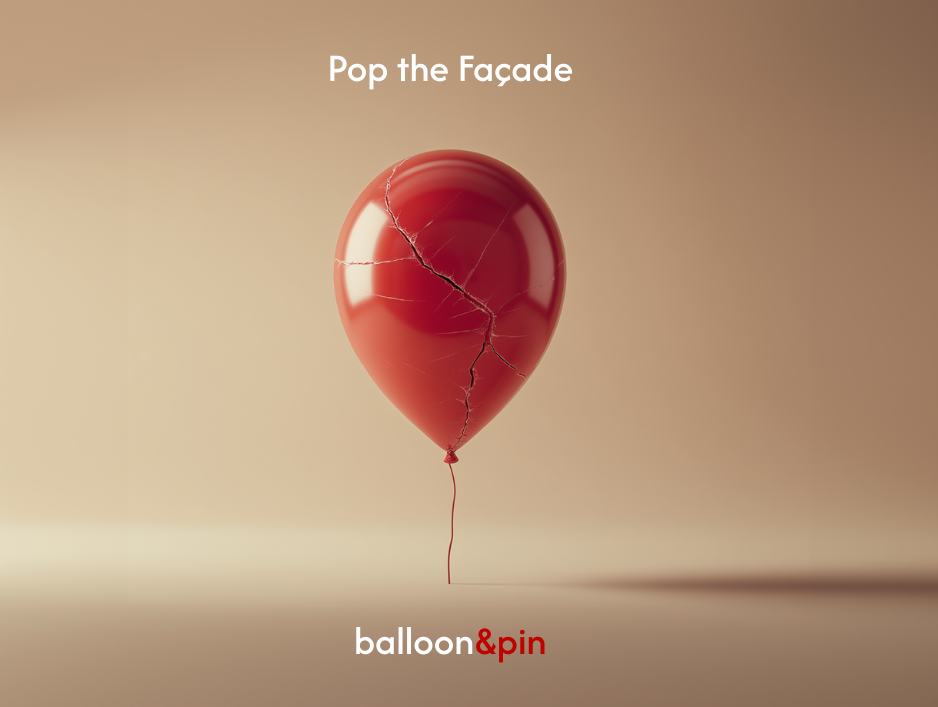
Balloon & Pin exists to release pressure. Each piece embodies the moment a balloon lets go of its forced shape. Nothing forced, nothing inflated. Just form returning to honesty. The brand celebrates people who choose their own outline instead of the one assigned to them.
Visual world
Imperfect elegance: matte metals, softened edges, textural shadows, and balloon folds translated into wearable geometry.
A grounded palette of metallics and off-whites, with one accent hue held in reserve for emotional emphasis.
Photography that feels intimate and tactile, highlighting creases, pressure marks, and lived-in material depth.
Graphic cues reflecting pressure and release: stretched text forms, pin-like lines, quiet distortions, and popped or torn edge details.
Tone of voice
Minimal, honest, and direct, speaking with emotional clarity rather than adornment.
Vocabulary anchored in tension, truth, release, shape, and presence.
Rejects trend language or glittery charm; prefers statements that feel like realizations.
Always ties the product back to the philosophy: jewelry as a state of mind.
-
Before.
-

After.
Key Assets
Brand identity system with a primary wordmark, color palette, type pairing, and spacing rules informed by pressure versus release.
Philosophy posters pairing bold typographic lines with abstract balloon-form imagery.
Product visualizations of balloon-derived jewelry pieces in matte metals, rendered with sculptural clarity.
Launch landing page featuring the core metaphor and the hero piece.
Campaign mini-set with three tension-and-release visuals, each anchored by one object and one line.
Marketing & Growth Approach
Target audiences: people seeking symbolic, emotionally charged accessories; minimalists; creatives; anyone rejecting performative aesthetics.
Acquisition: Instagram editorial grids, artist collaborations, story-driven short videos, and philosophy-first messaging.
Launch phases:
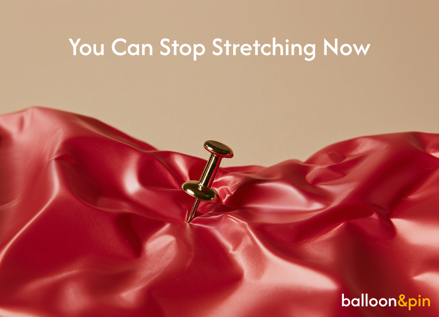
Tease: short cryptic lines (“You can stop stretching now”) with balloon-form visuals.
Launch: reveal the brand philosophy, first collection, and the deflated-balloon designs.
Sustain: spotlight real users and how they interpret “release” in their own lives.
Flagship campaign: “Pop the Facade,” turning tension and release into a visual transformation across social and print.
Repurpose loop: close-ups, philosophy lines, motion stills, and behind-the-design notes woven into a consistent grid.
Testing: try variations in message framing (philosophical vs. tactile), color pops, and product scales.
-

#C10100
-

#FFB300
-

#FEF9EE
Font: Afacad
Systems & Ops
A tight modular identity system with clear rules for palette, spacing, and type.
Content calendar built around “pressure and release” moments, giving structure to drops.
Ready-to-use templates for posters, product cards, social assets, and philosophy statements.
A growing library of textures, balloon folds, lighting references, and type styles to protect consistency as the brand expands.
Archetype Reflection
As an Outlaw brand, Balloon & Pin resists conformity without becoming hostile or chaotic. The risk of the archetype is alienation or obscurity. The counterbalance is restraint.
The brand channels rebellion through form, material, and absence rather than provocation. It does not shout. It punctures.
By grounding the Outlaw impulse in the discipline of the Creator, Balloon & Pin stays legible, wearable, and repeatable while still holding a clear ideological edge.


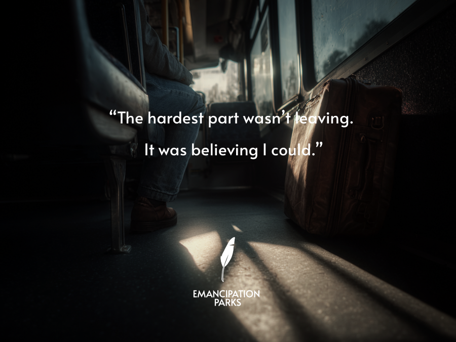
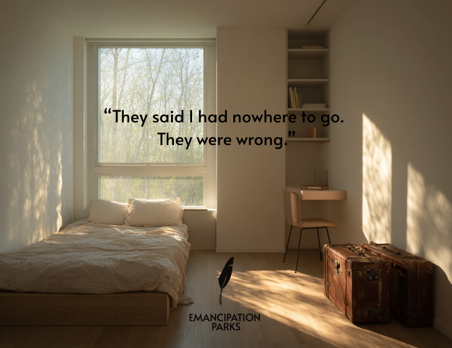
Emancipation Parks
A new kind of home for young people who need to leave before home breaks them. Emancipation Parks create intentional living spaces where 18 to 21 year olds can step out of damaging environments without falling into homelessness or chaos. These spaces give structure, safety, and cultural nourishment so residents can rebuild themselves with dignity.
Brand Archetype
Emancipation Parks are built primarily on The Caregiver, with a strong secondary pull from The Explorer.
The Caregiver archetype shows up in the commitment to safety, dignity, and consistent support. The parks exist to hold people steady while they rebuild, offering protection without control and care without shame. Support is reliable, not conditional.
The Explorer archetype shapes the underlying philosophy. Leaving is framed as a necessary journey toward self-definition. Residents are encouraged to discover who they are outside inherited roles, expectations, and emotional climates that constrained them.
Challenge
Young people who leave dysfunctional homes face a false choice: stay and shrink, or escape into instability.
Existing systems only respond to crisis. If you are not abused, addicted, or homeless, you are left without support.
Most youth programs offer supervision, not liberation. They manage behavior instead of developing inner strength.
The challenge is to create a place where leaving is not an act of desperation, but a grounded step toward becoming who you are meant to be.
Creative direction
Emancipation Parks exist to make growth possible. They offer a real home, not a shelter. Residents get room to breathe, space to think, and exposure to the ideas, art, and tools that expand identity. This is not about rescue. It is about building a self that was never allowed to emerge at home.
Visual world
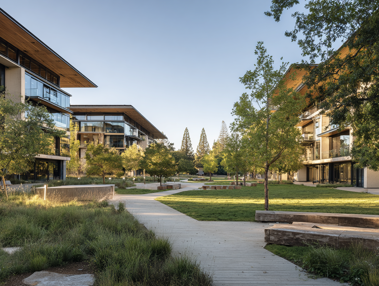
A calm, honest environment: soft neutrals, natural textures, large open rooms, architectural stillness.
Photography that feels observational rather than staged. Real faces. Quiet moments. Light moving through space.
Symbols of autonomy: open doors, notebooks, headphones, beds that are made with care, hands holding books or sketchpads.
A visual rhythm of growth: morning light, long corridors, framed silhouettes, intentional quiet.
Tone of voice
Direct, steady, and protective.
Speaks to residents as adults, not as cases or troubled youth.
Names emotion without dramatizing it: pressure, clarity, independence, rebuilding.
Focused on agency, not crisis. Freedom as a practice, not a dramatic leap.

Font: Alata
Key Assets
A home page that explains the third path: not staying, not running, but relocating with intention.
A resident handbook written in simple, grounded language: how the home works, what support exists, what freedom means.
Program materials for education through culture: daily film screenings, album sessions, reading lists, reflection cycles.
A stipend model that rewards artistic output and participation without turning the center into a competition.
A three year path that moves residents from arrival to clarity to independence.
Marketing & Growth Approach
Target audience: young adults who feel trapped at home but do not fit the definitions used by shelters or state programs.
Partners: artists, entrepreneurs, and mentors who were once these kids and can speak with authority and lived truth.
Launch phases:
Tease: powerful statements about leaving with dignity.
Launch: documentary style visuals inside the first center.
Sustain: real resident stories on growth, art, and becoming.
Flagship message: Leaving is not failure. Leaving can be the beginning.
Content loop: resident projects, creative work, community moments, and educational artifacts feed a consistent narrative of transformation.
Systems & Ops
A structured daily rhythm centered on culture: morning quiet time, afternoon workshops, evening art study.
Independent living support: financial literacy, cooking, job placement, emotional education.
A safe and clear ruleset for communal living that respects autonomy while protecting everyone.
Partnerships with legal advisors to support residents who need help navigating emancipation or family separation.
A growing playbook so new centers replicate the philosophy without diluting it.
Archetype Reflection
As a Caregiver brand, Emancipation Parks’ greatest strength is trust. Its greatest risk is dependency or overprotection. This is balanced by the Explorer archetype, which ensures the goal is movement, not comfort.
Structure exists to make freedom sustainable, not to replace it. The parks do not promise rescue or permanence. They promise a place to stand while you learn how to move forward on your own terms.
Emancipation Parks do not tell young people who to become. They give them proof that they have options.