
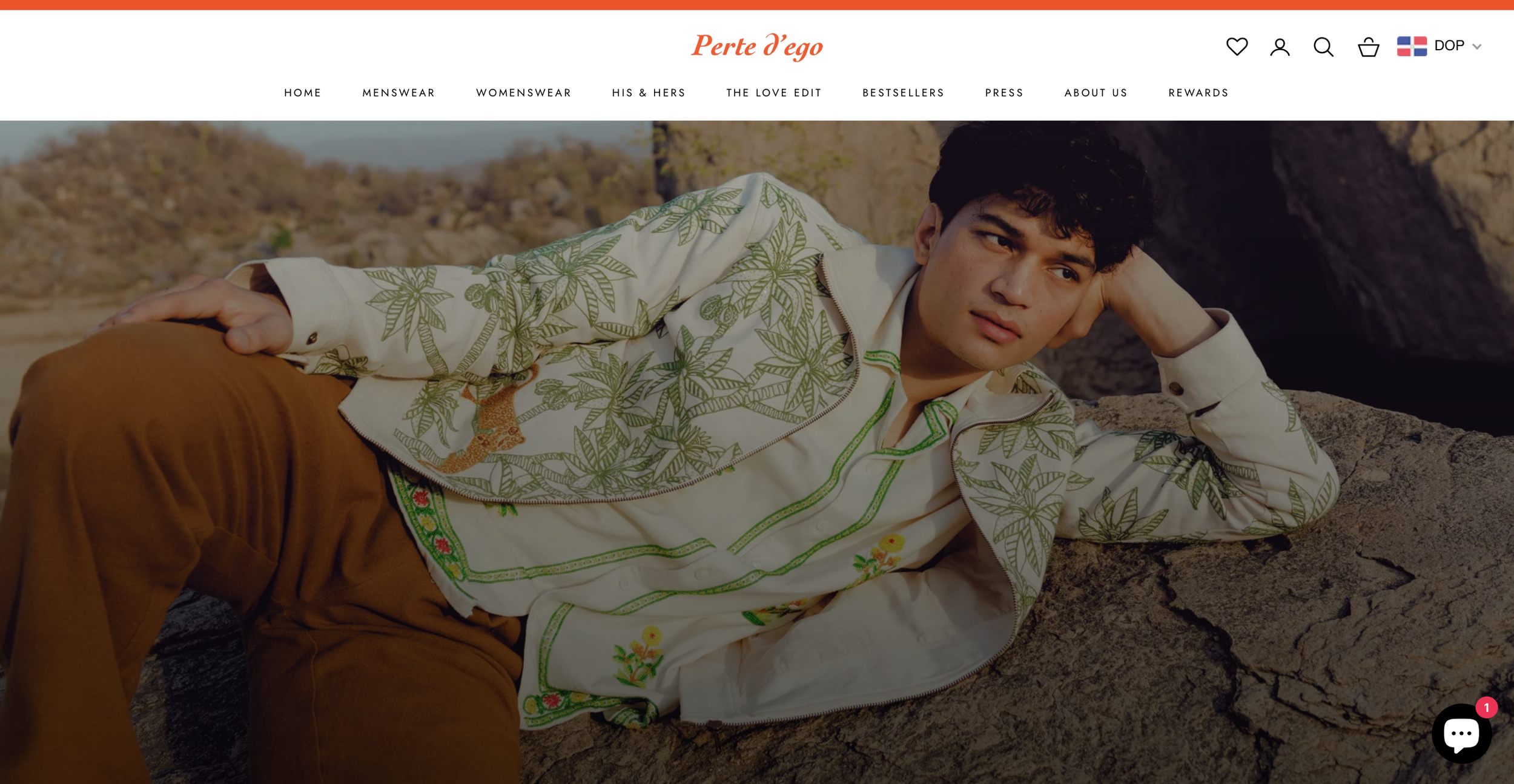
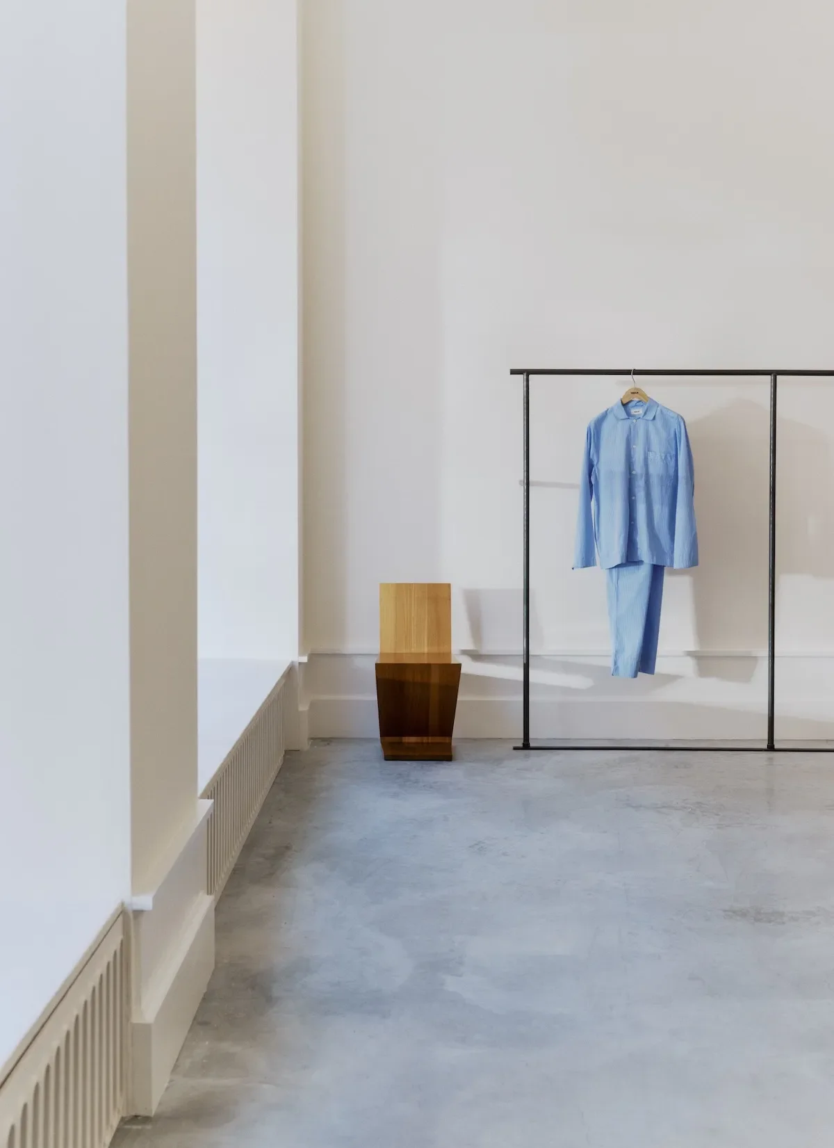
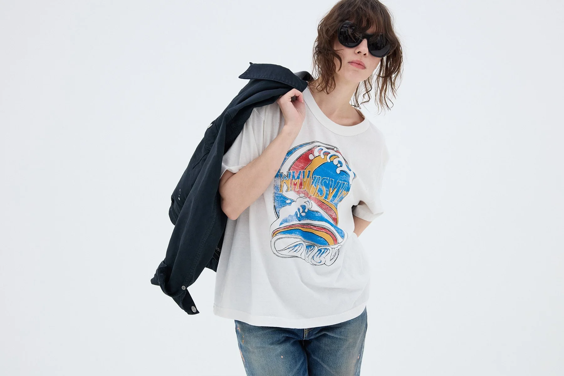
Perte d’ego
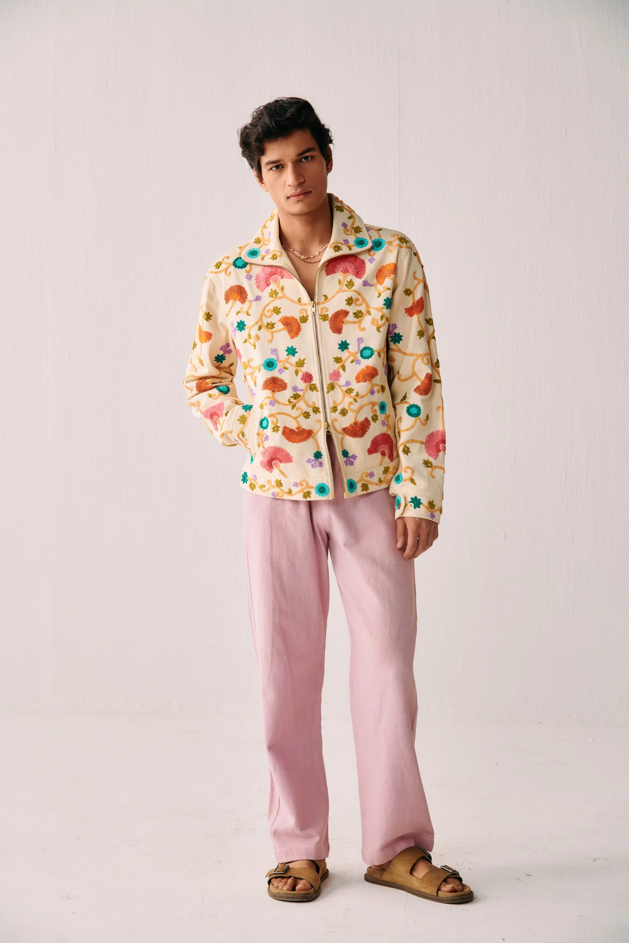
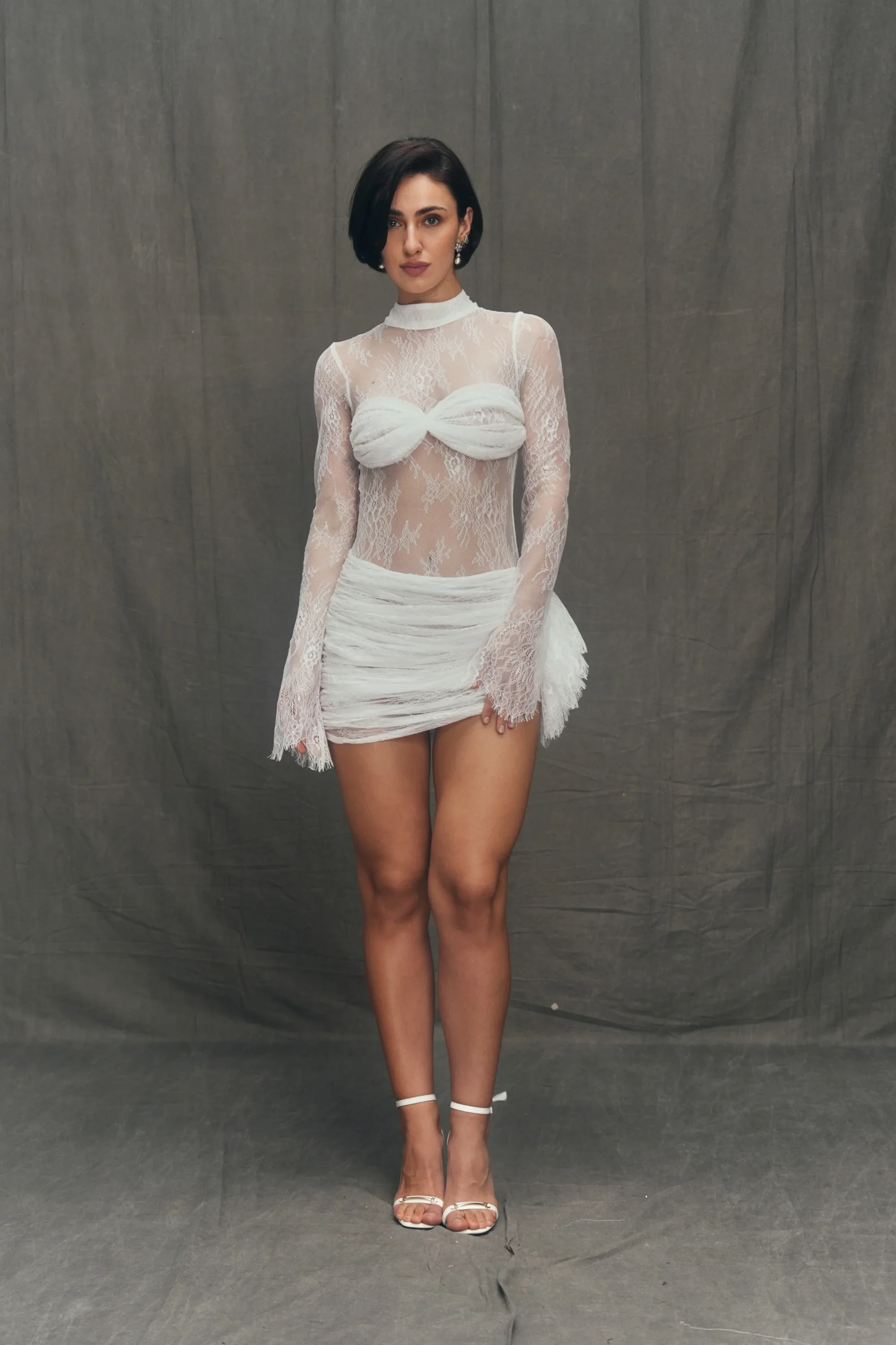
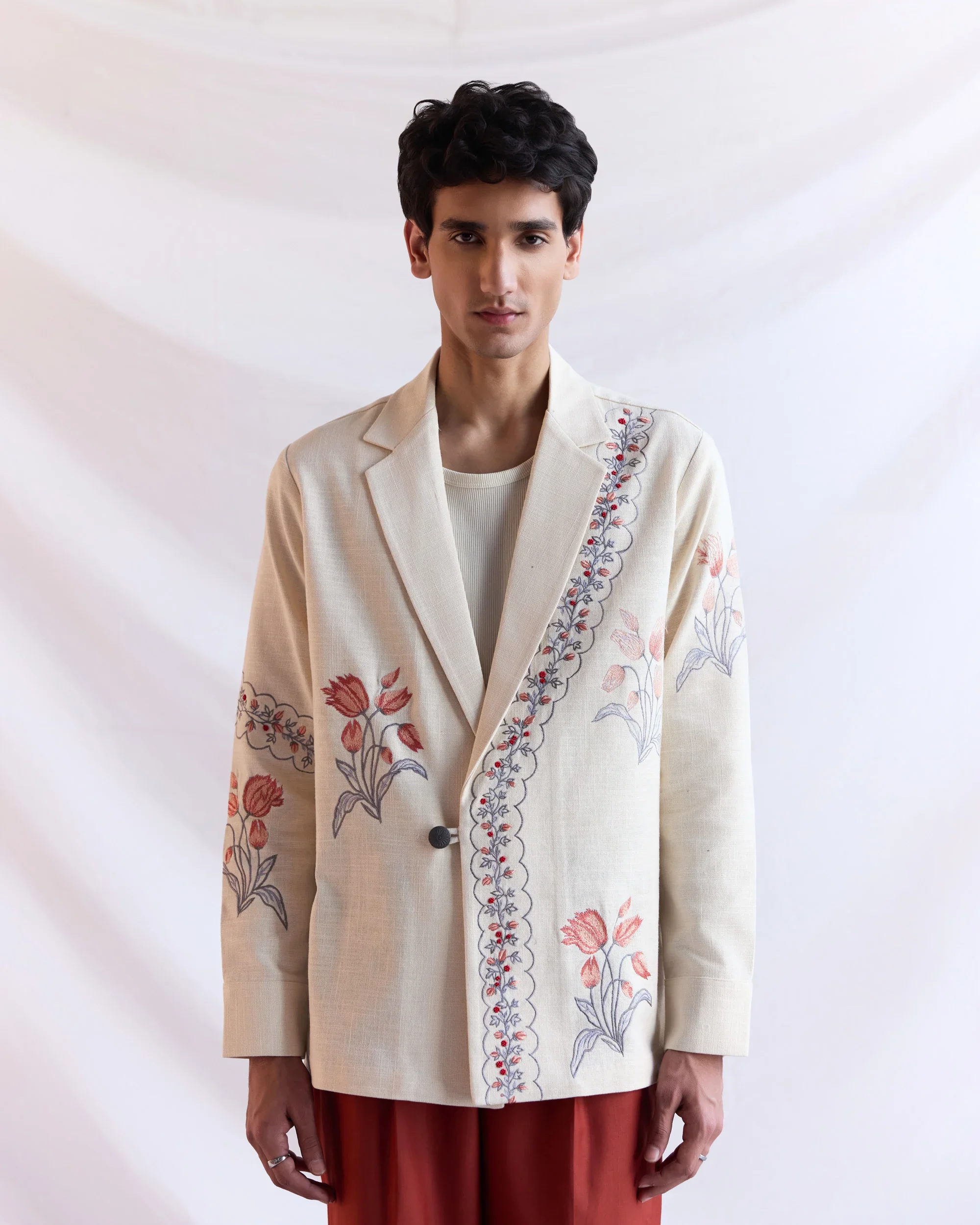
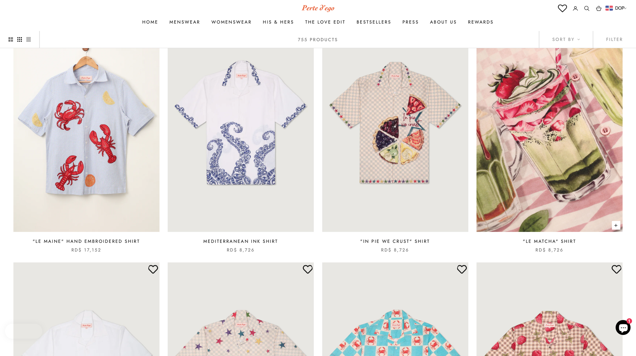
India-based fashion brand built around handmade, one-of-a-kind pieces made in New Delhi, with a mix of embroidered shirts, blazers, resort sets, and womenswear. The brand frames itself around sustainability, craftsmanship, and a “necessary luxury” position.
What’s not landing
The brand language is strong in spirit, but the positioning still feels broad: sustainable, handmade, one-of-a-kind, meaningful, luxury. It needs a clearer center.
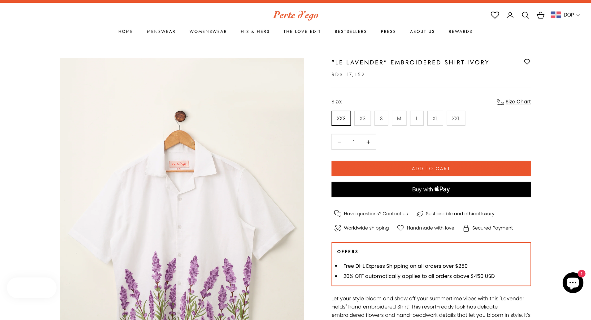
Product assortment is wide, but the visual and verbal hierarchy may not be doing enough to separate hero products from the rest of the catalog.
“One of a kind” and craftsmanship are compelling, but they could be translated more directly into product-page tension, rarity, and desire.
The luxury angle is there, but it could feel more resolved and singular rather than spread across several adjacent ideas.
What I’d tighten
• Sharpen the core position around rarity plus craftsmanship, not just sustainability.
• Create a clearer product hierarchy built around hero silhouettes and hero pieces.
• Push a more resolved distinction between collectible statement pieces and entry pieces.
• Tighten the product-page language so every page sells form, finish, and emotional value, not just the item.
• Build a more explicit visual rhythm between handmade detail, fit, and aspiration.
dIRECTION
The brand should feel less like a broad handmade fashion label and more like a collectible wardrobe world, romantic, rare, and exacting. The work should make craftsmanship feel immediate, but also make the product feel culturally charged and worth owning, not just ethically made.
REFERENCE sYSTEM
-
Clear Hierarchy
-
Column Flow
-
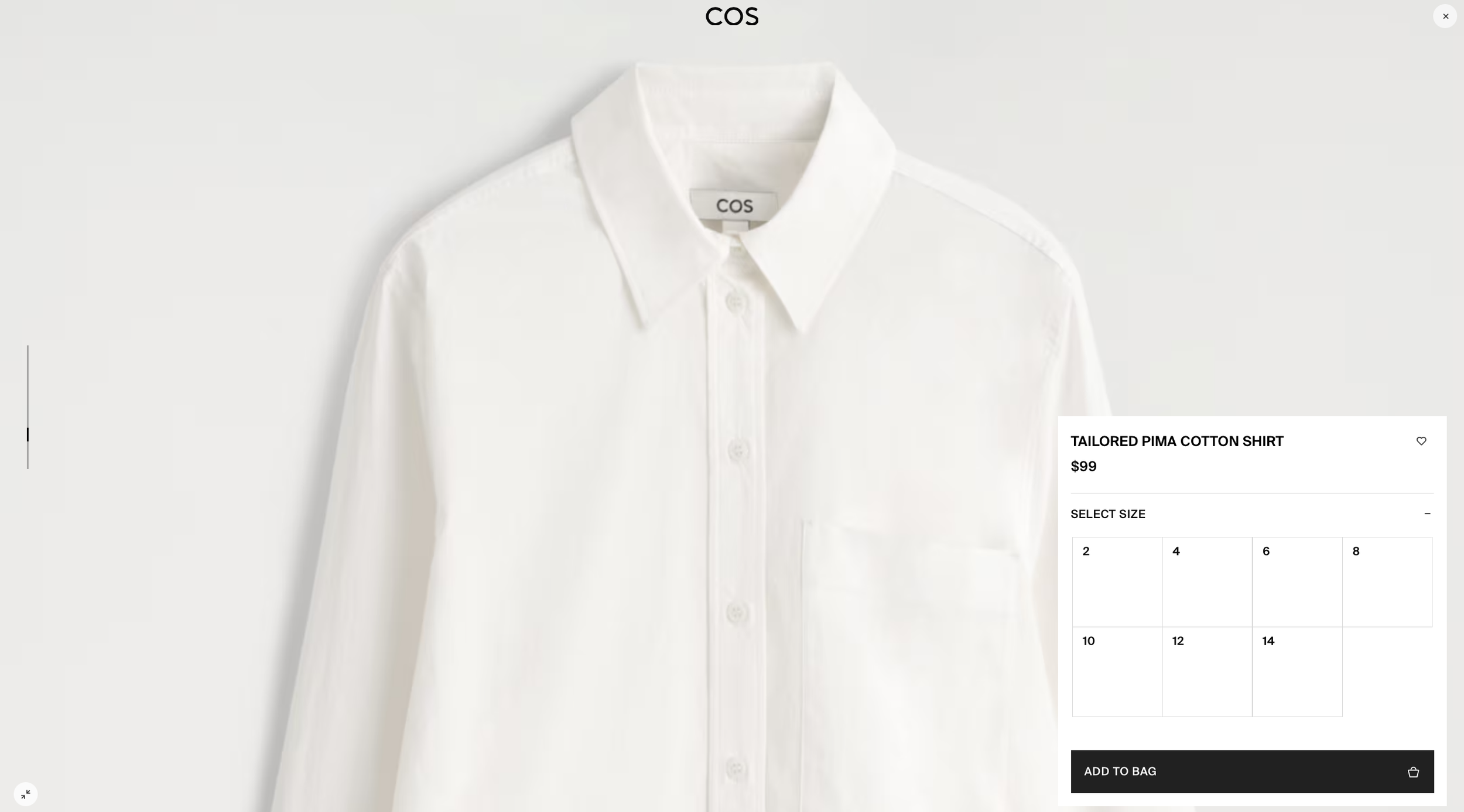
Product First
-
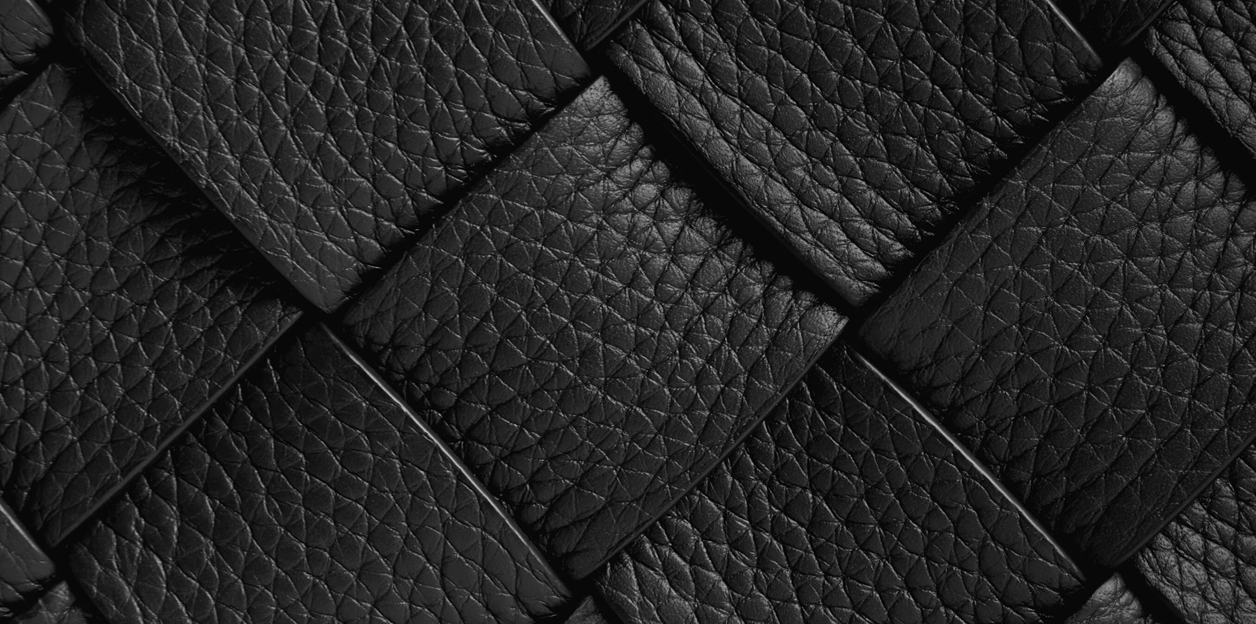
Material Depth
-
Stitch Precision
-
Tactile Tension
-
Recognizable Identity
-
Controlled Tone
-
Composed Framing
Performance Outlook
• 10–15% increase in conversion rate driven by clearer product positioning and stronger first impression.
• 15–25% improvement in product page engagement through better hierarchy and content flow.
• 20–30% higher save rate on social content by emphasizing material detail and craftsmanship.
• 12–18% rise in returning visitors driven by a more defined and recognizable brand identity.
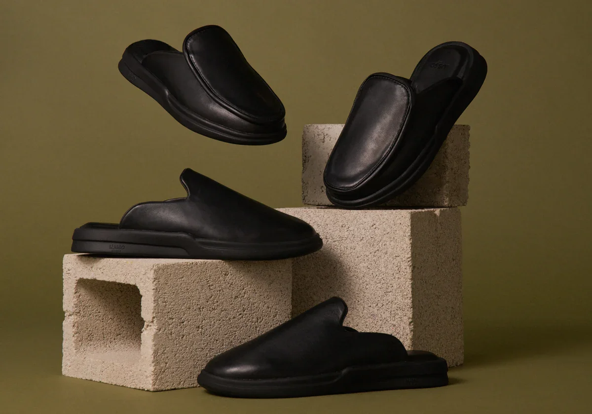
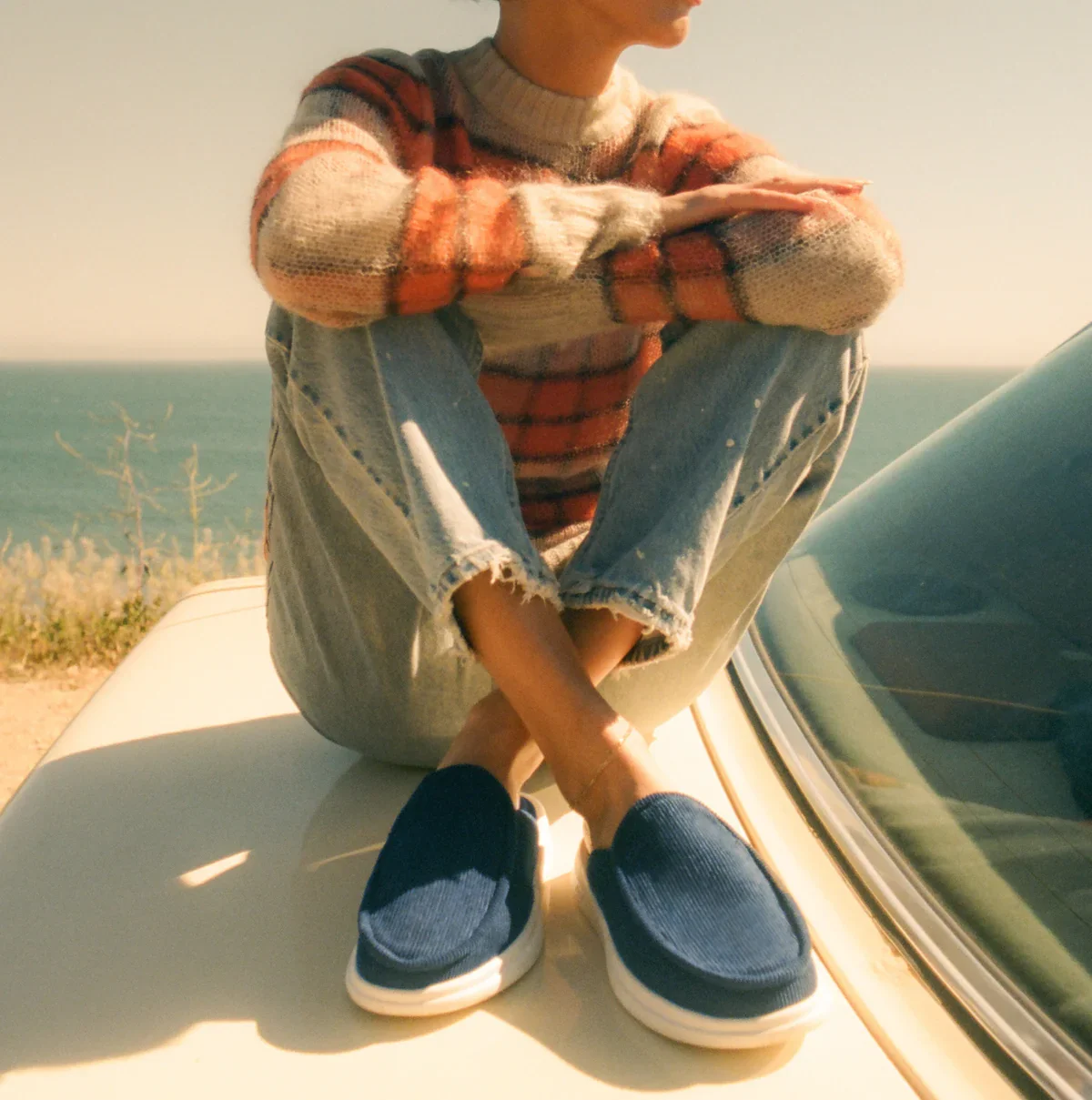
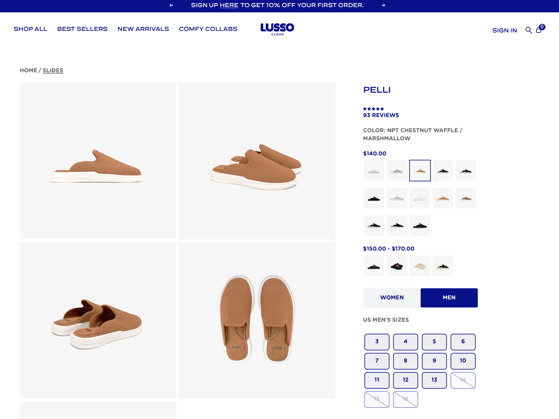
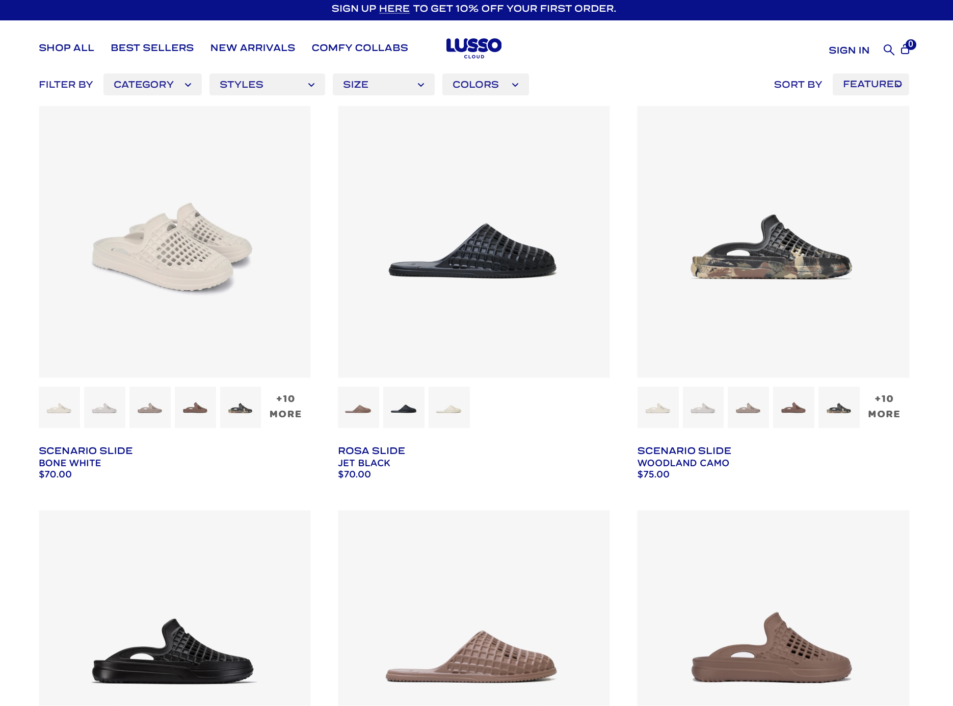
Lusso CLOUD
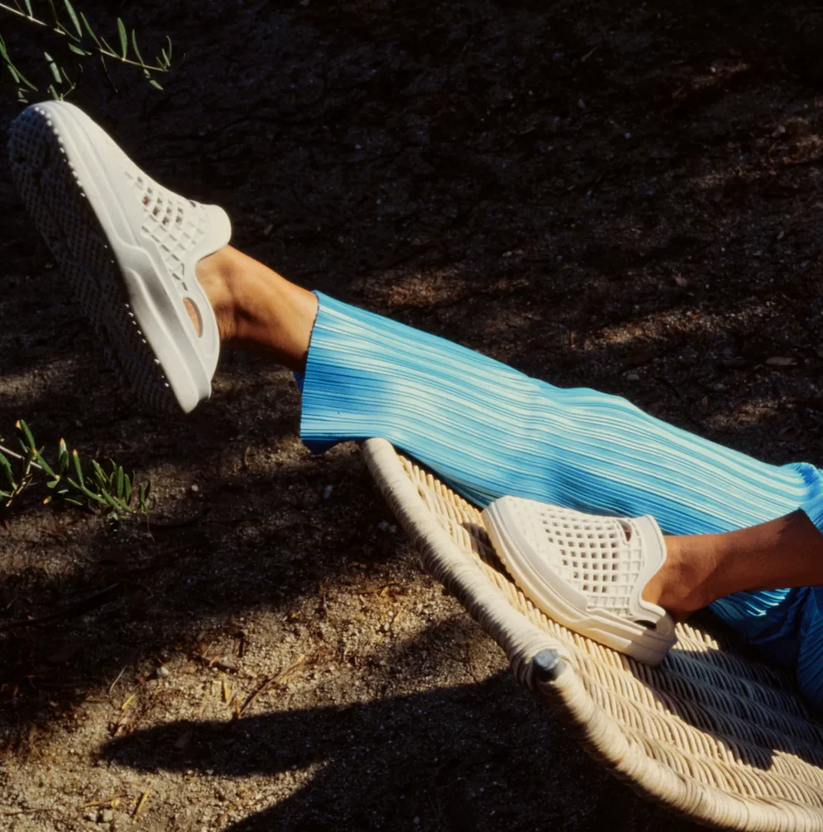
U.S.-based footwear brand focused on ultra-comfort slip-ons inspired by luxury hotel slippers, positioned as everyday “comfort-first” lifestyle shoes.
What’s not landing
Positioning leans heavily on comfort, but lacks a sharper emotional or cultural angle.
Product feels interchangeable with other comfort footwear (Crocs, Yeezy slides, etc.).
Visual language doesn’t fully elevate the “luxury” claim.
Messaging repeats comfort claims without building stronger product desire.
Product pages rely more on claims than on felt experience.
What I’d tighten
Shift from “comfort” to comfort as identity / lifestyle signal.
Build a clearer distinction between Lusso and generic recovery footwear.
Elevate product framing to feel more intentional and collectible.
Strengthen hierarchy between hero models and supporting products.
Introduce stronger sensory cues (feel, weight, softness).
Direction
Move the brand from passive comfort into expressive comfort. The product should not just feel good, it should create moments people want to react to, show, and talk about.
REFERENCE sYSTEM
-
Visual Contrast
-
Hero Focus
-

Sensory Impact
-
Cultural Signal
-
Visible Softness
-
Playful Energy
Performance Outlook
• Share rate scales 2–3x as content moves from low-arousal comfort to high-arousal (awe / amusement).
• Engagement per post rises 30–50% through more expressive, attention-grabbing product storytelling.
• 25–40% lift in organic reach per post, driven by higher interaction and distribution.
• Conversion rate improves 8–12%, translating increased attention into actual sales.
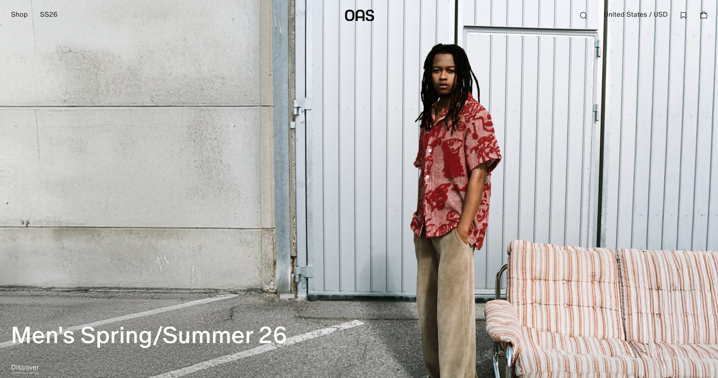
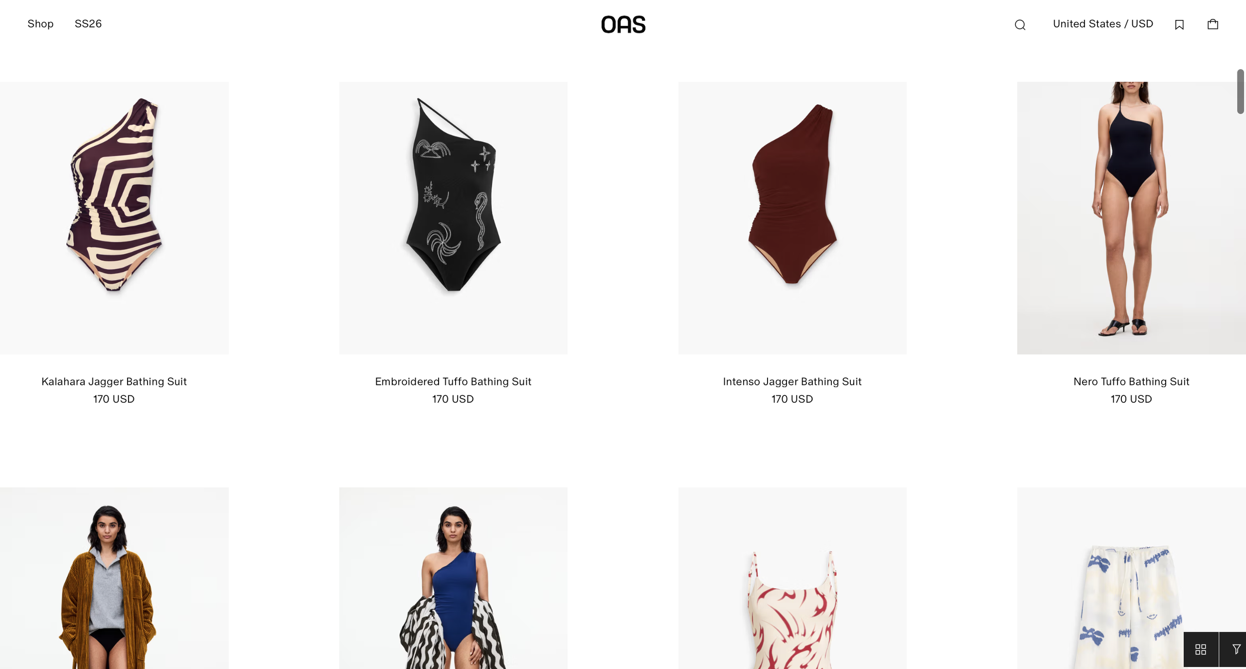
OAS
Swedish resortwear brand built around year-round vacation dressing, blending Scandinavian ease with Mediterranean color, pattern, and texture across shirts, swimwear, terry, crochet, and accessories.
What’s not landing
The aesthetic is defined, but it still carries too much northern distance inside a tropical world.
The brand feels visually resolved, but emotionally undercharged.
The Caribbean enters mostly as surface, color, weather, ease, but not yet as spirit.
There is a strong look, but not yet a strong why.
The product is desirable, but the world around it could feel more alive and more meaningful.
What I’d tighten
Bring more warmth, movement, and pulse into the creative direction.
Keep the restraint, but let the tropical side feel less observed and more inhabited.
Push the brand from resortwear aesthetic into a more lived, emotionally charged point of view.
Build a clearer emotional reason behind the product, not just a visual one.
Make the identity feel lighter, freer, and more awake without losing its sophistication.
Direction
The brand should feel like more than a European gaze on the Caribbean. It should keep its discipline and taste, but let in more life, more ease, and more internal heat. The work needs to move from well-styled vacation wear into something that feels inhabited, felt, and grounded in a clearer reason for being.
REFERENCE sYSTEM
-
Color Breathing
-
Human Rhythm
-
Human Texture
-
Soft Structure
-
lived warmth
-
Sun-worn feel
Performance Outlook
• Save rate rises 18–28% as the brand shifts from tasteful resortwear to something more emotionally alive and memorable.
• Engagement lifts 20–35% through warmer, less distant creative that feels more inhabited than observed.
• Returning visitor rate improves 12–20% as the brand develops a clearer identity beyond seasonal vacation dressing.
• Conversion rate grows 6–10% by tightening the link between aesthetic appeal and emotional meaning.
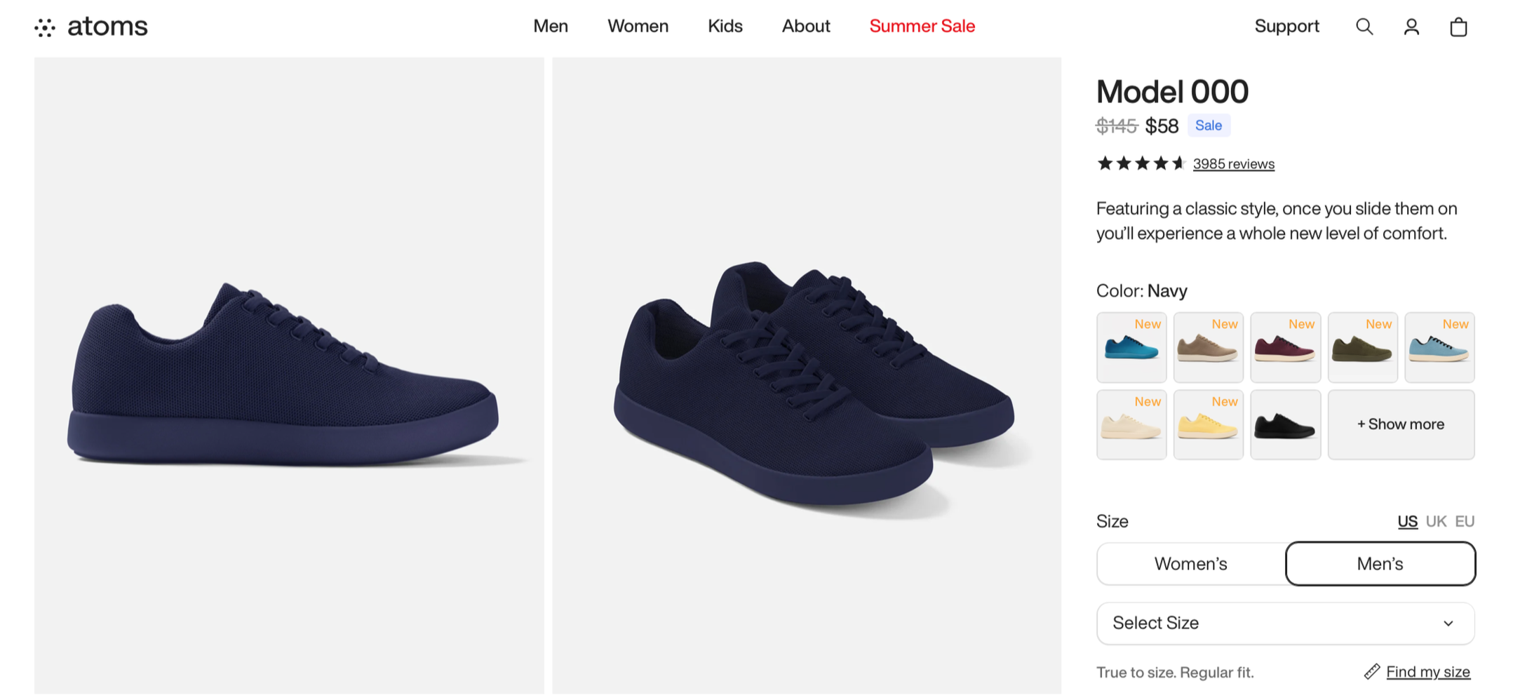
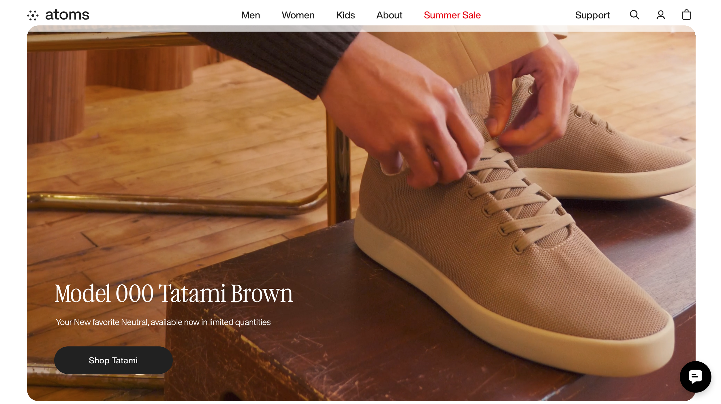
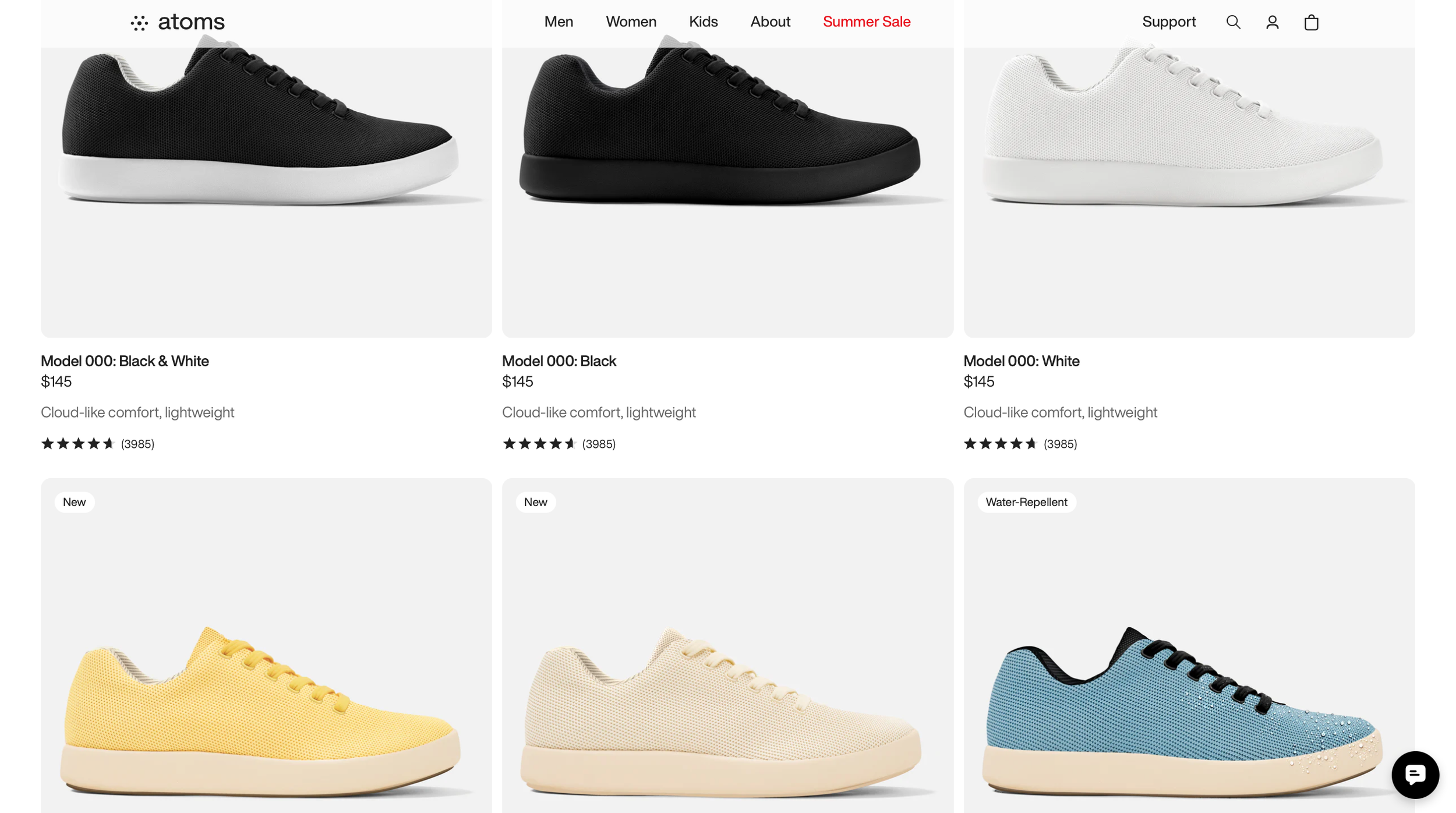
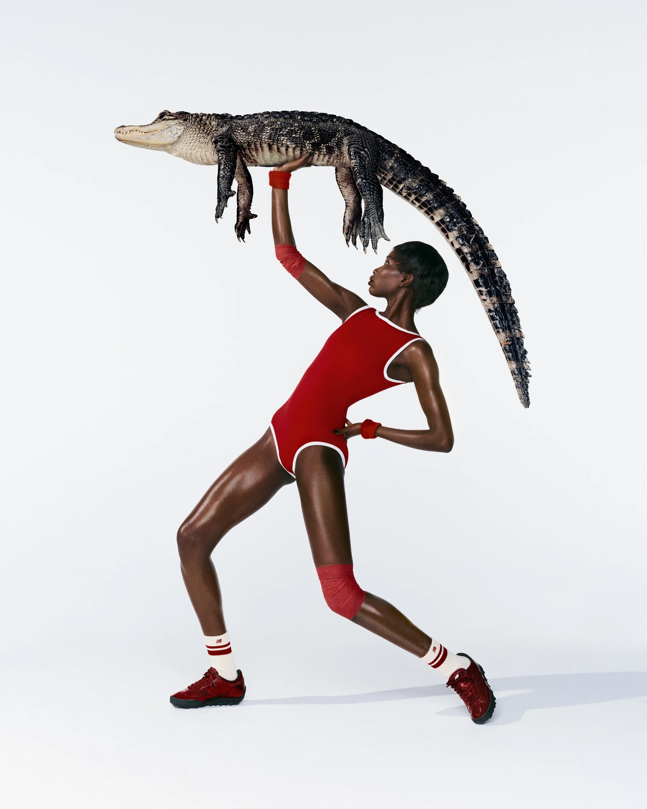
ATOMS
New York based sneaker brand built around obsessive product thinking. Known for quarter sizing, comfort engineering, and a rational design mindset. Gained cultural traction through Humans of New York which gave the brand human depth early on.
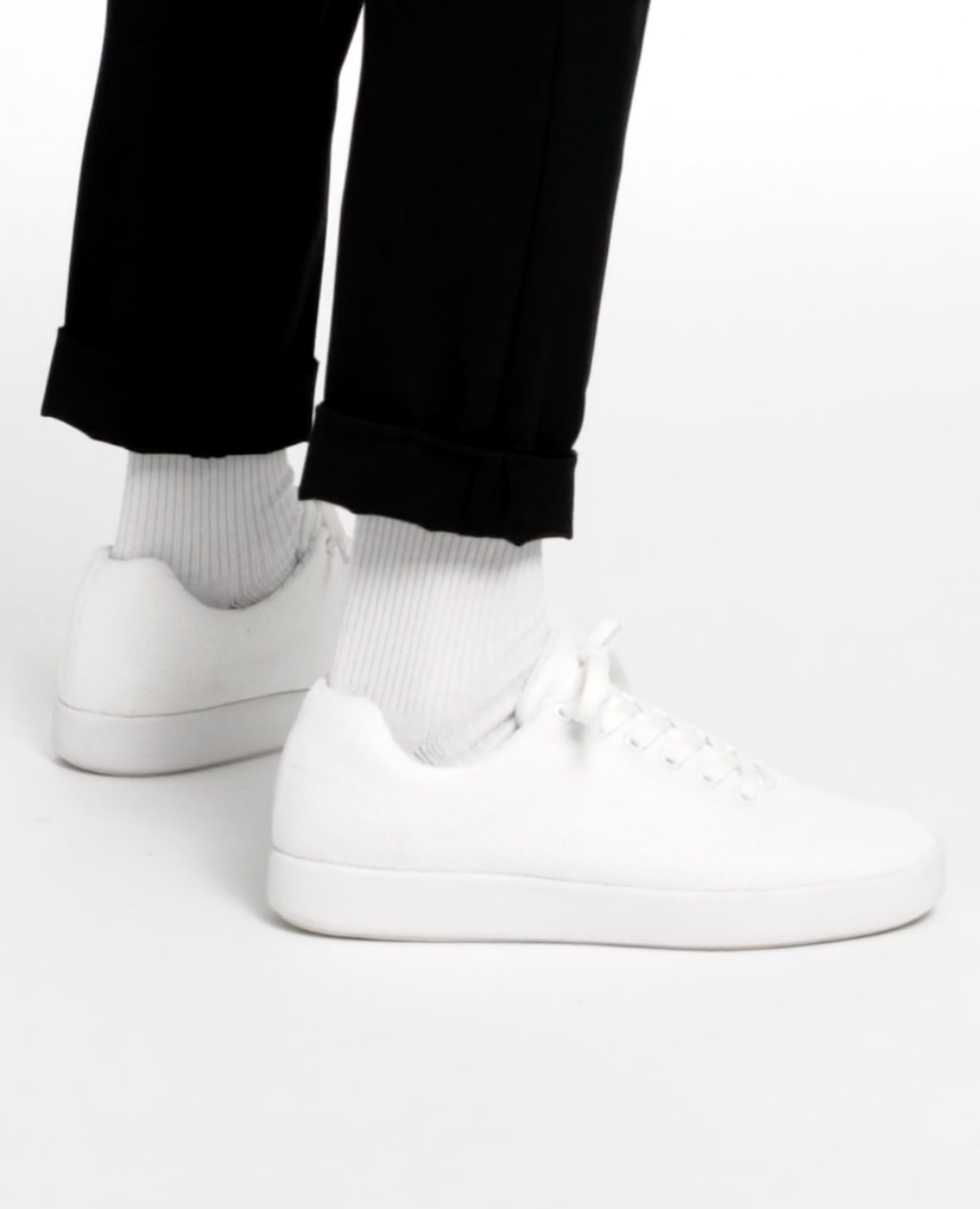
What’s not landing
The brand energy is too flat. Feels engineered but not felt.
Product intelligence is strong but emotional pull is weak at first glance.
Visual world leans safe minimal instead of memorable or shareable.
Story exists but is not translated into daily life or cultural moment.
Feels like a good decision, not a compelling desire.
What I’d tighten
Inject controlled play without breaking the rational tone.
Turn everyday use into expressive micro moments.
Push contrast between precision and personality.
Build a visual system that feels alive, not just correct.
Translate features into surprising, slightly cheeky interactions.
Direction
Keep the product exactly as is. Change the energy around it. Atoms should feel like intelligence with personality, not intelligence alone. The shift is from quiet competence to confident charm. Still precise, still thoughtful, but now with moments that catch attention, create delight, and make people want to share it. The goal is not loudness. The goal is presence.
REFERENCE sYSTEM
-
Energy Grid
-
Material Focus
-
Lively Calm
-
Story Blocks
-
Engine Reveal
-
Real Motion
Performance Outlook
• Conversion rate increase from 2.1% to 3.4% driven by stronger emotional engagement on first visit.
• Social shares per product page increase by 65% due to more expressive and unexpected visuals.
• Average session time increase from 1:10 to 1:55 as users engage with richer storytelling layers.
Add to cart rate increase by 28% from clearer emotional plus functional positioning.