
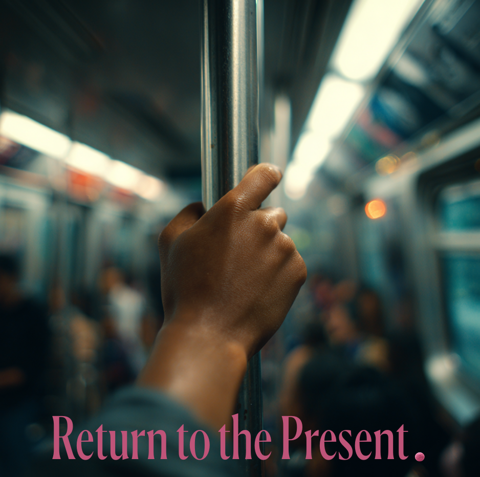
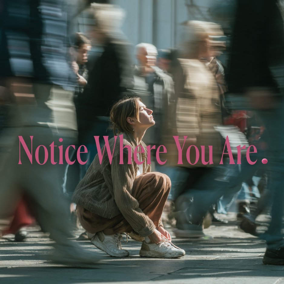
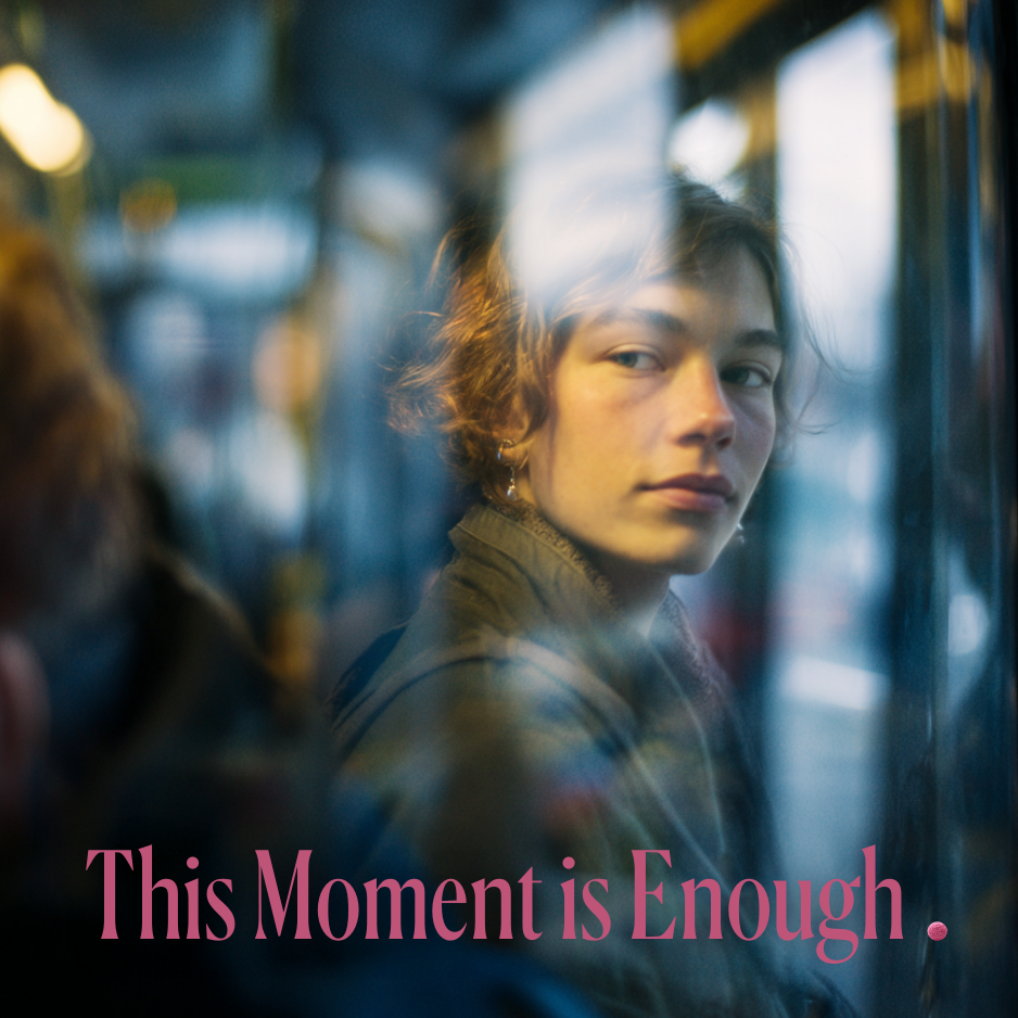
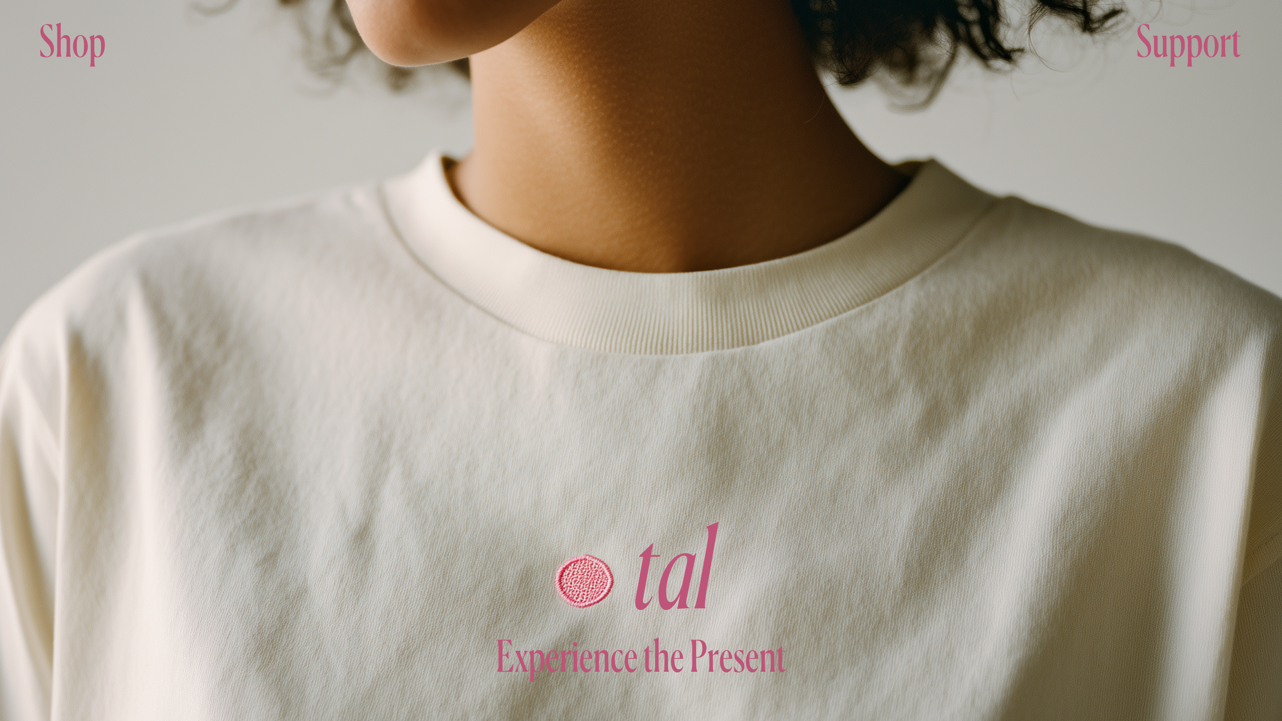
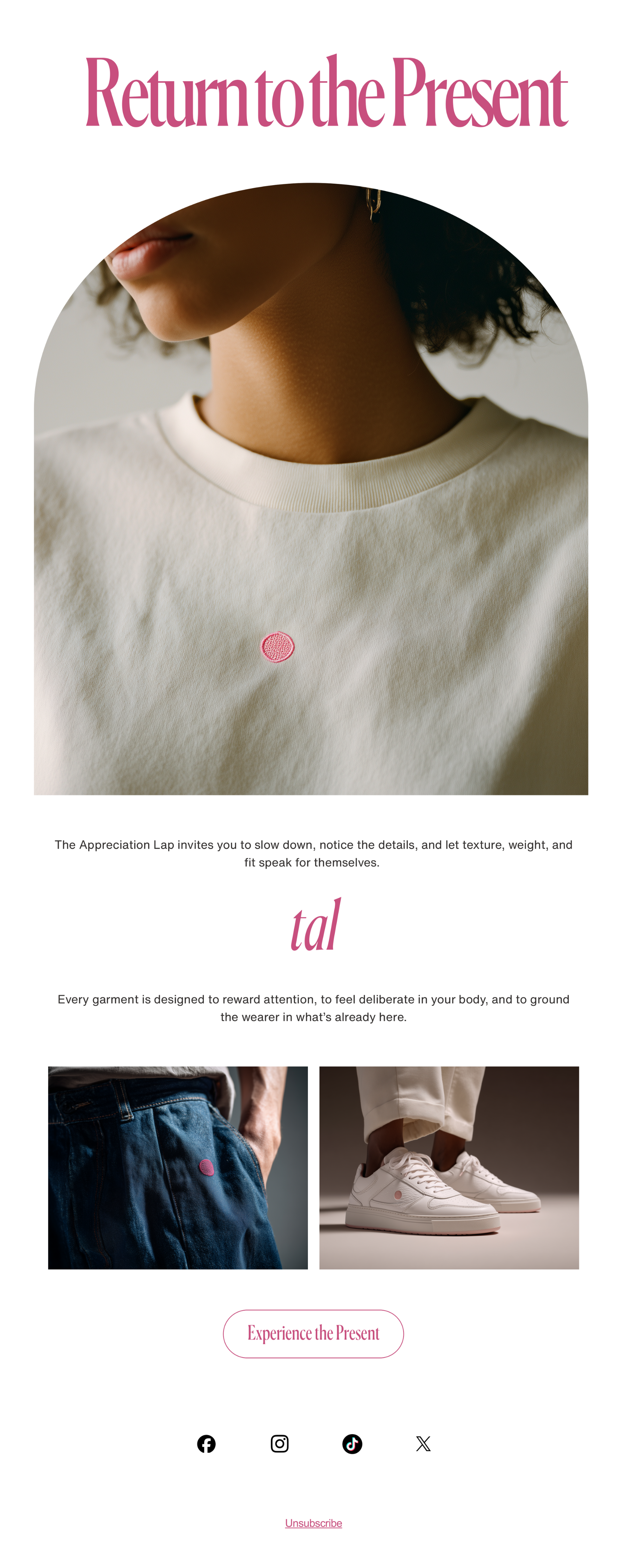
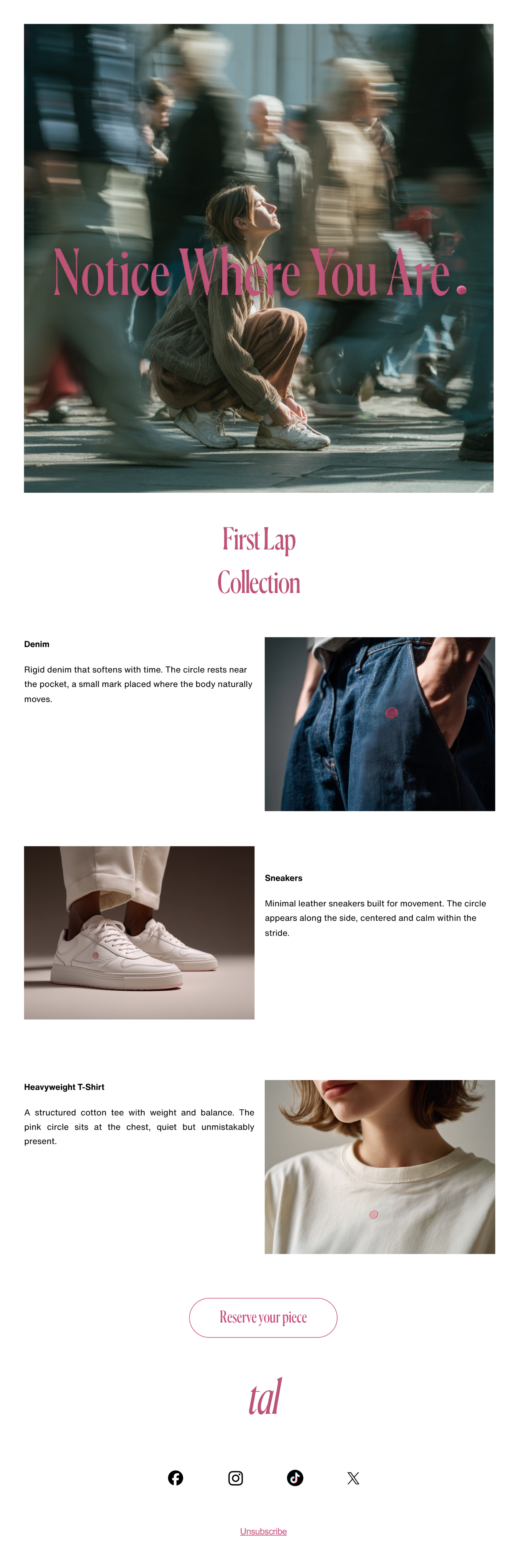
TAL
TAL (The Appreciation Lap) is fashion brand built for people who return. Not to trends or nostalgia, but to the present. It treats clothing as a way to slow perception down and inhabit a moment fully. The lap is the turn you take back into what is already here.
CHALLENGE
Fashion has become fast, performative, and symbolic to the point of emptiness. Logos shout while trends expire instantly.
At the same time, many people want clothing that feels grounded and intentional. Objects that reward attention instead of broadcasting identity.
TAL needs a brand system that expresses this philosophy clearly without relying on spectacle or trend signals.

CREATIVE DIRECTION
TAL exists to make appreciation tangible. The brand treats clothing as a way to re-enter the present: weight, texture, fit, and placement are all designed to slow the wearer down.
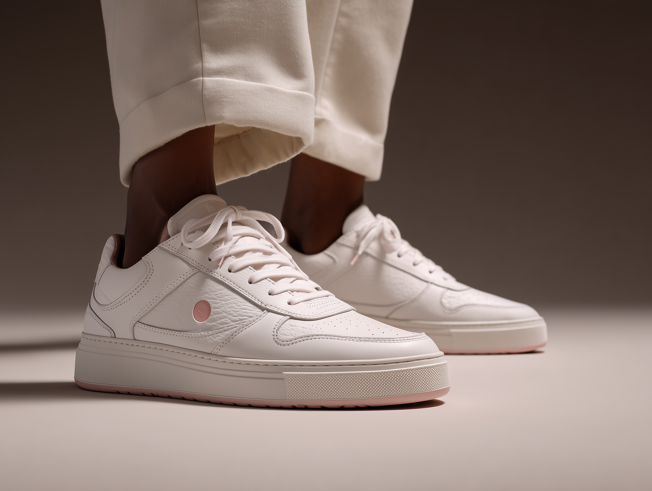
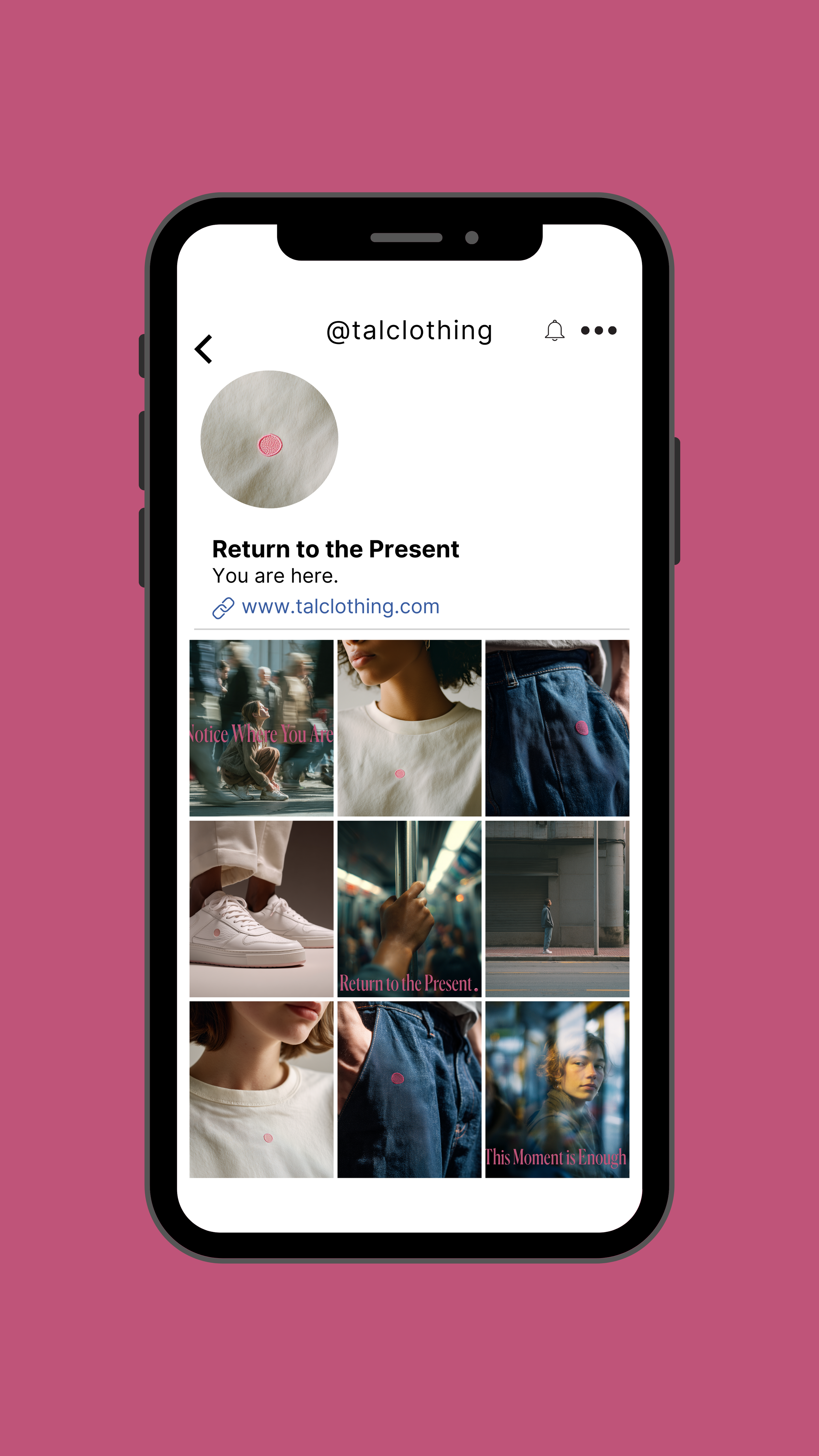
Logos are never centered. They live in peripheral zones: ribs, thighs, soles. Discovery replaces declaration. Materials do the talking. The circle, recurring throughout the system, represents return rather than perfection. Pink signals awakening, not sweetness: flesh, presence, first sensation.
Visual world
Heavyweight fabrics with visible texture and structure.
Restrained palettes anchored by soft pink used with intention.
Minimal silhouettes with unconventional logo placement.
Photography that feels observed rather than staged.
Graphic systems built around repetition, spacing, and tactile detail.
Tone of voice
Direct, spare, and thoughtful.
Assumes intelligence and curiosity.
Favors precision over performance.
Repeats ideas through consistency, not emphasis.


Marketing & Growth Approach
Target audience: designers, writers, engineers, architects, and operators with developed taste who value material quality and subtle design.
Distribution: small production runs released through the brand site and select design-focused boutiques to keep discovery intentional.
Launch phases:
1. Tease: fabric textures, peripheral logo placements, the circle symbol, and short statements about return and attention.
2. Launch: the first TAL drop paired with editorial photography and a short text explaining the philosophy behind the garments.
3. Sustain: irregular drops that expand the system through new materials, placements, and subtle variations.
Flagship campaign idea: The Appreciation Lap. Wearers describe the moment they noticed the garment differently.
Creative reuse: each release generates fabric studies, garment details, and wearer portraits reused across social, web, and editorial channels.
Testing and learning: observe repeat wear, noticed details, and returning customers. Future releases evolve from these signals.
Brand Applications
Selected email work
Performance Outlook
• 6–9% Instagram engagement rate driven by philosophy-led visuals and minimal editorial storytelling.
• 20–28% save rate on posts exploring attention, perception, and material detail.
• 18–25% repeat purchase rate supported by limited releases and long-term wardrobe staples.
• 30–40% organic discovery growth through design communities, word-of-mouth, and editorial circulation.
• 22–30% returning visitor rate on the collection landing page driven by curiosity around subtle product details.
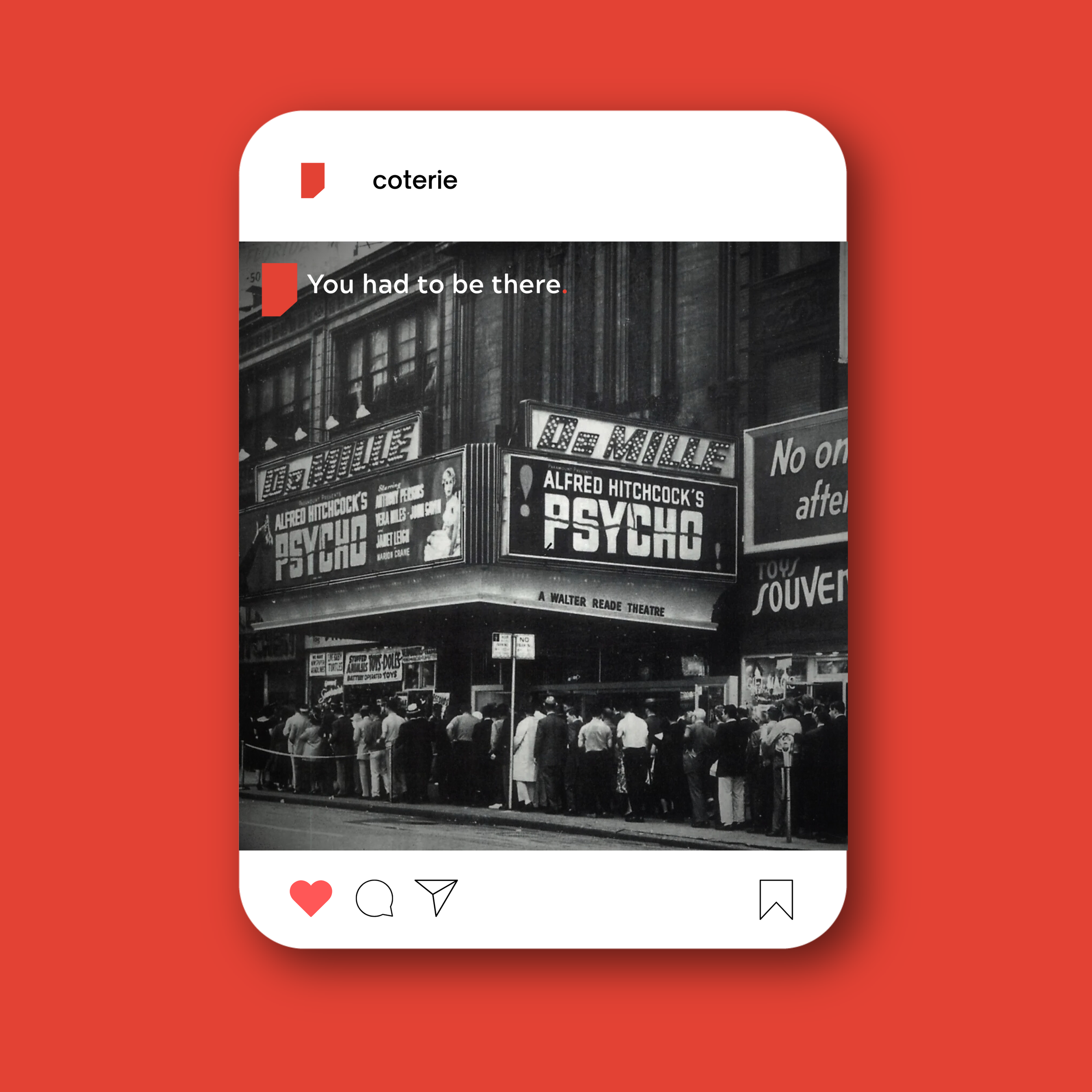
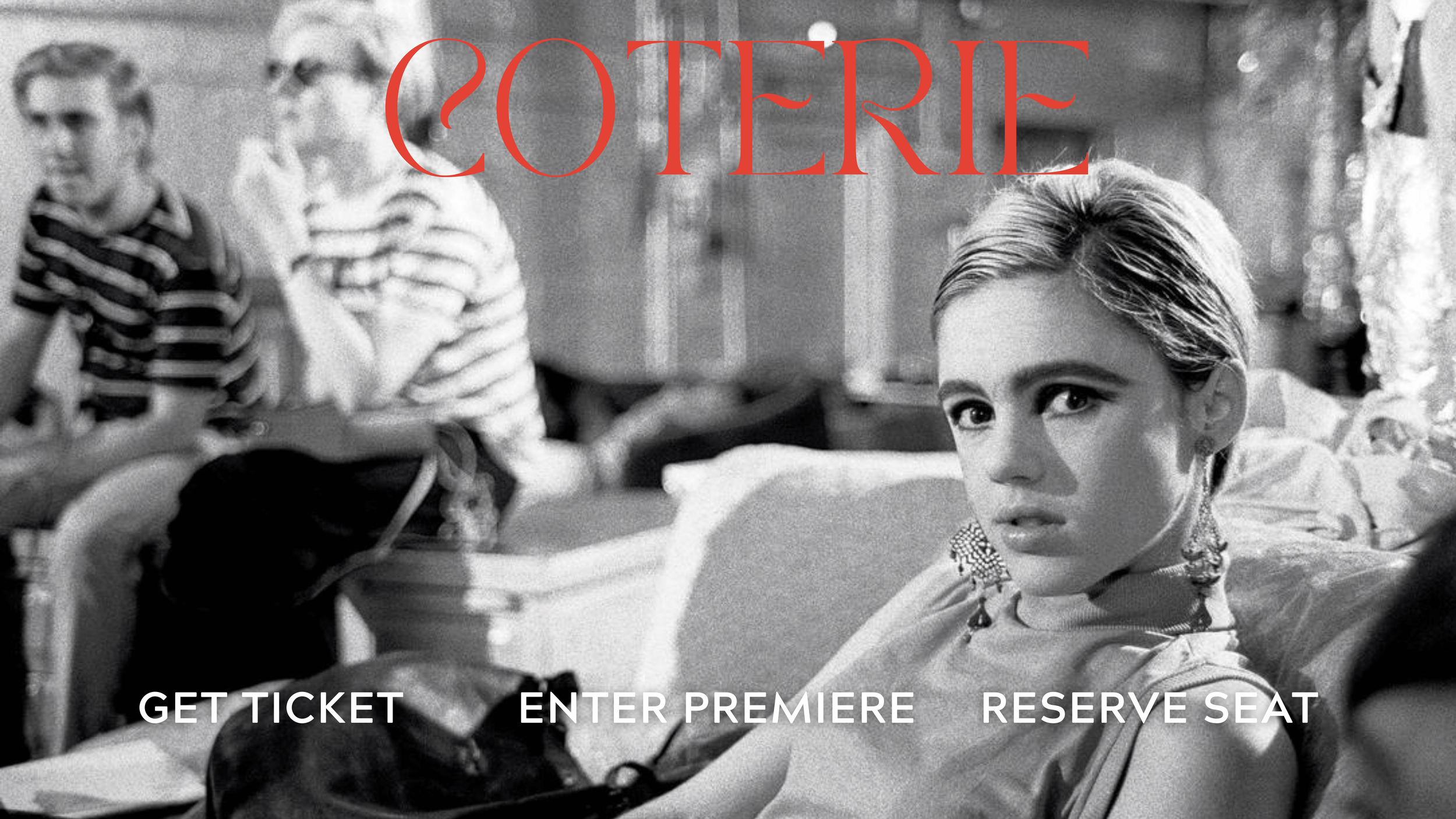
Coterie
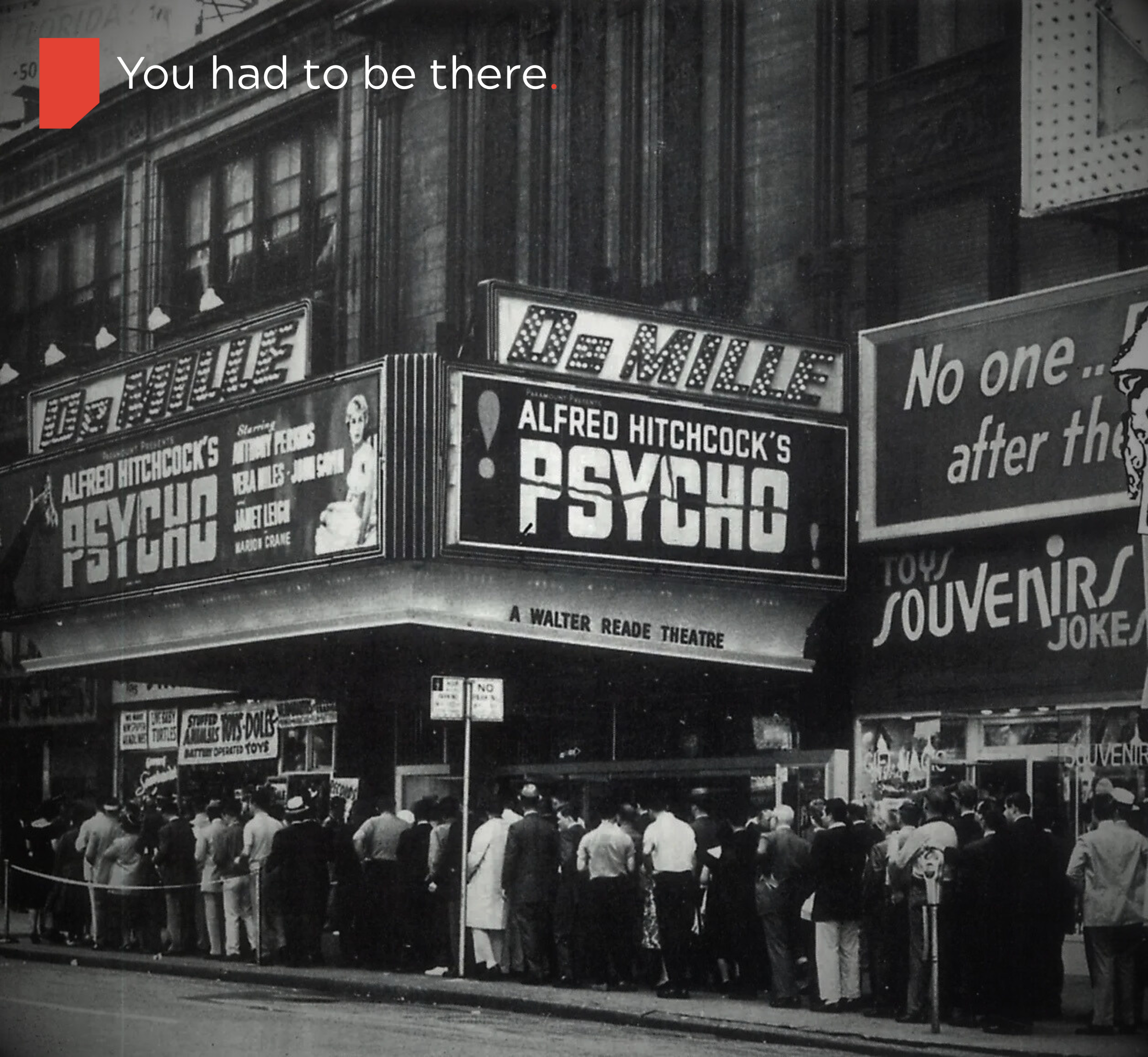
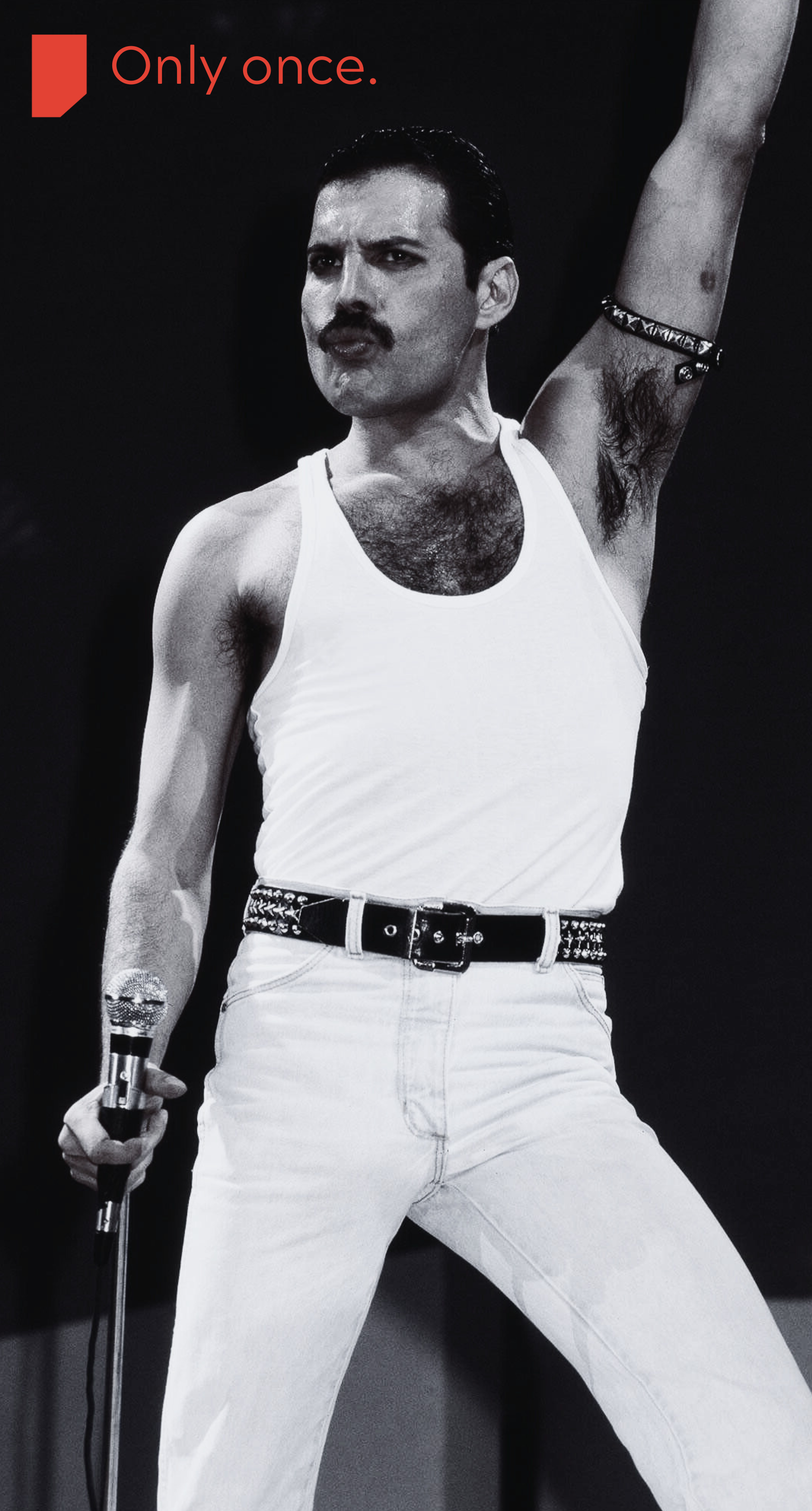
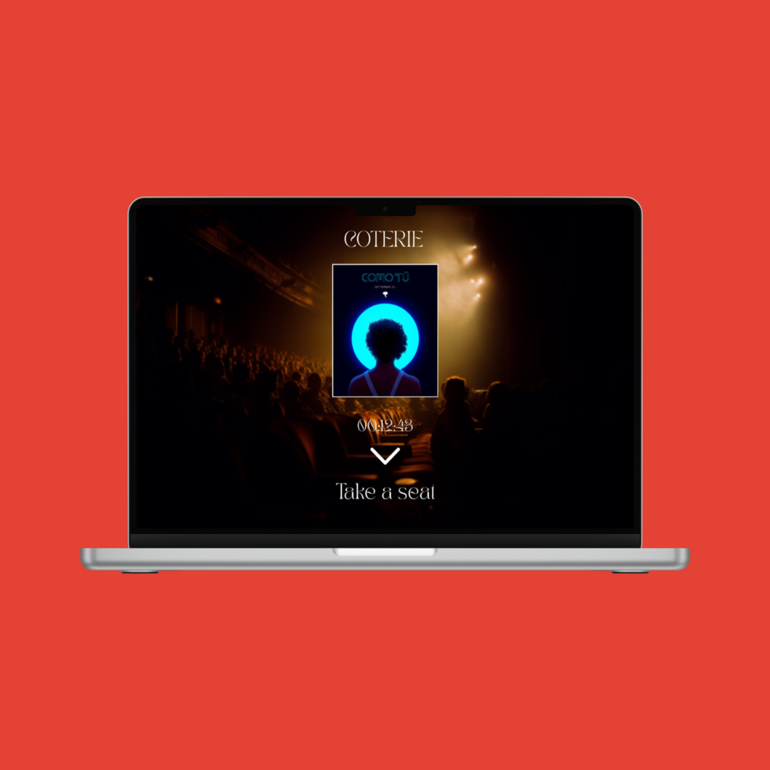
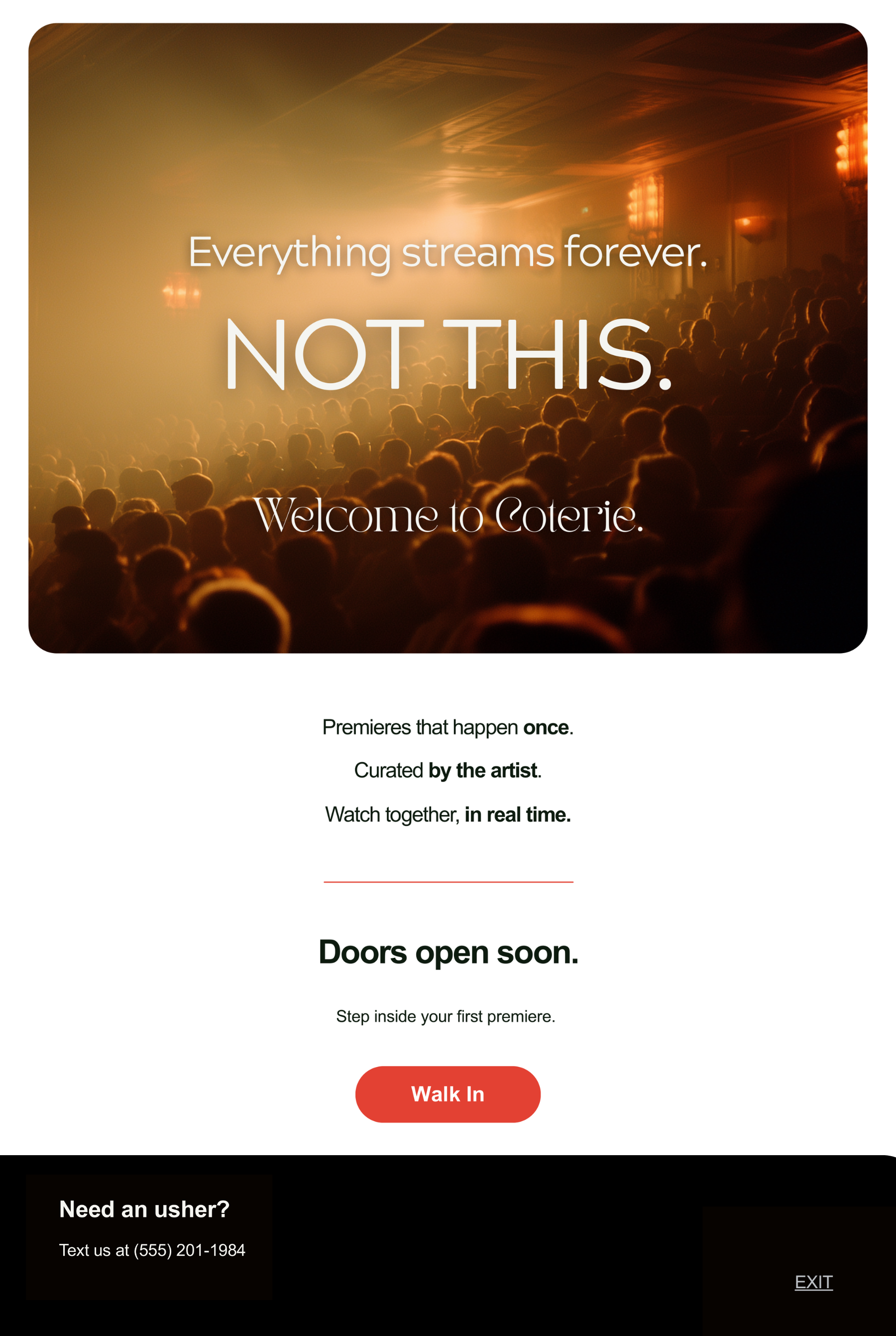
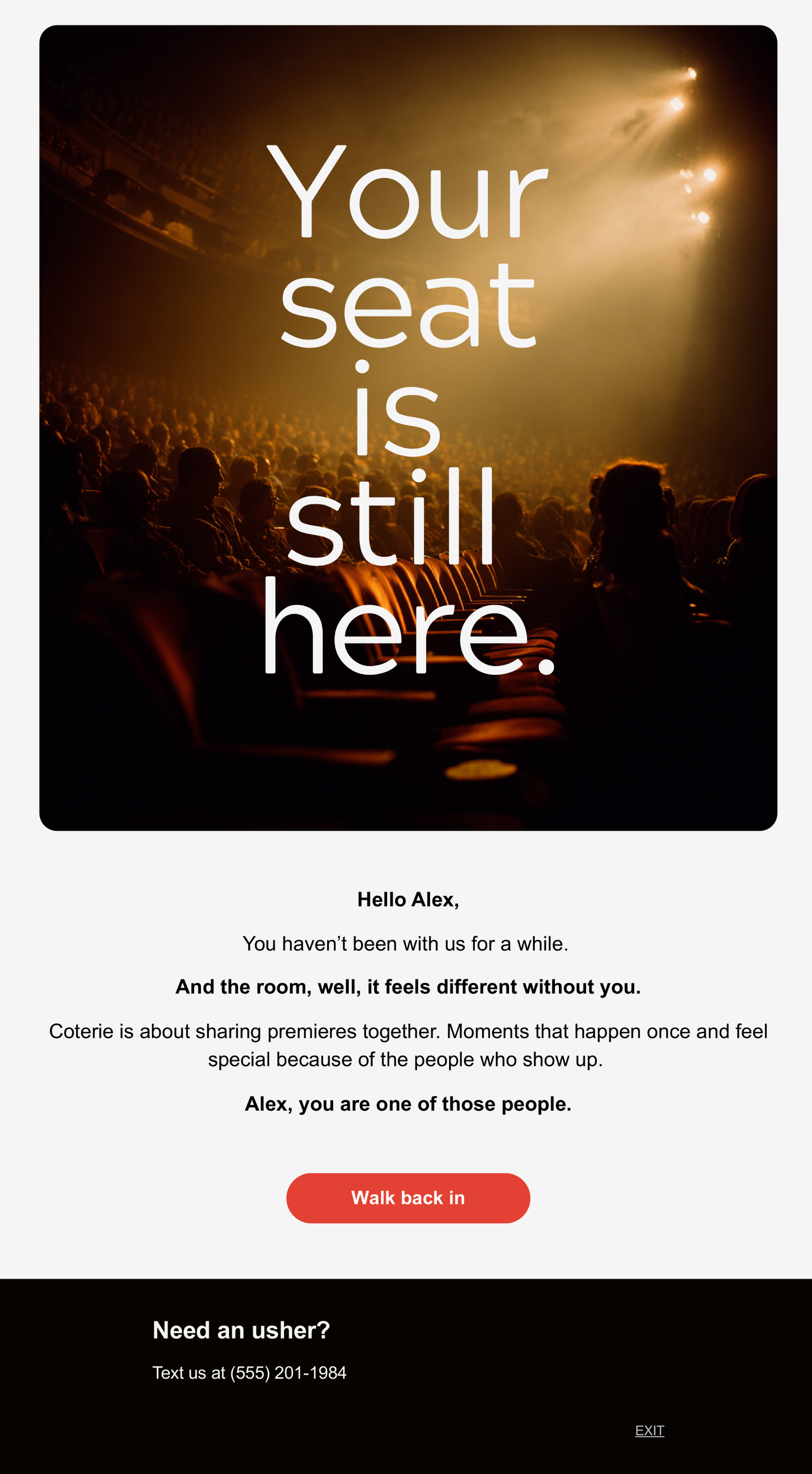
A digital premiere house for artists who want their releases to feel like an event, not a content drop. It creates one-time, paid, time-limited experience audiences gather to watch together. Once over, the work becomes unavailable till the artist chooses its next release stage.
Challenge
Streaming has flattened releases into endless scroll, killing the sense of occasion around new work.
Artists are buried inside algorithms, with little control over how their premieres feel or how they monetize them.
Fans have access to everything, yet rarely feel like they were truly there when something important arrived.
Creative direction
Coterie exists to bring back the ritual of release. Every premiere is treated like an opening night: limited, intentional, and charged with presence. Artists choose how their work appears, who gets in, and what happens after. Fans are not passersby, they are witnesses.
Visual world
Interface that feels like a gallery: dark or soft neutral base, minimal chrome, strong focus on the work itself.
Typography with quiet authority, mixing a clean grotesk for product UI with a more characterful serif for titles and event posters.
Photography and illustration that feel cinematic and documentary, leaning on grain, shadows, and framing rather than loud color.
Visual cues that signal “event” time: countdown clocks, ticket motifs, subtle light spill effects, and poster-like key visuals for each premiere.
Tone of voice
Calm, confident, and slightly cinematic, speaking to artists and fans like adults, not users.
Prefers precise, concrete language over hype, more “doors open at nine” than “you do not want to miss this.”
Honors the artist by name and craft, never treating their work as disposable content.
Avoids slangy, trend chasing, or algorithm talk. This is about art, time, and presence.
Marketing & Growth Approach
Target segments: independent filmmakers, musicians, and multidisciplinary artists who already have some audience but want more control over premieres, plus early adopter fans who value being first and close to the process.
Acquisition channels: direct outreach to artists, partnerships with small labels and film collectives, targeted social around specific premieres, and a strong editorial blog or newsletter telling the stories behind events.
Launch phases:
Tease: announce the concept with your own premiere and a small circle of artists, building intrigue around “digital openings.”
Launch: run a short “season” of curated premieres, each with its own poster, social kit, and behind the scenes material.
Sustain: roll out tools so artists can apply to host their own premieres, while continuing to curate flagship events.
Flagship campaign idea: “I Was There First,” a recurring series of premieres where attendees receive a small digital badge or artifact proving they were at the original drop.
Creative reuse: every premiere generates a loop of assets: posters, trailers, quotes from chat, artist commentary, all repurposed across social, email, and the homepage without diluting the event feel.
Testing and learning: experiment with price points, seat limits, event formats, and messaging frames, then standardize what consistently drives attendance, repeat usage, and artist satisfaction.
Brand Applications
Selected email work
Performance Outlook
• 12–16% social engagement rate on premiere announcements driven by poster-style visuals and countdown mechanics.
• 4–6% click-through rate on premiere campaign posts directing audiences to ticketed events.
• 18–25% conversion rate from landing page visitors to premiere attendees due to scarcity-based messaging and limited access windows.
• 20–30% audience return rate for subsequent premieres after attending a first event.
• 15–22% social share rate during premiere week as attendees signal participation in “I Was There First” releases.
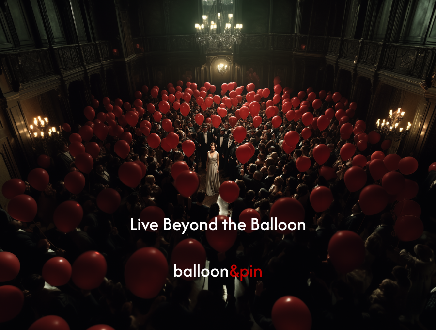
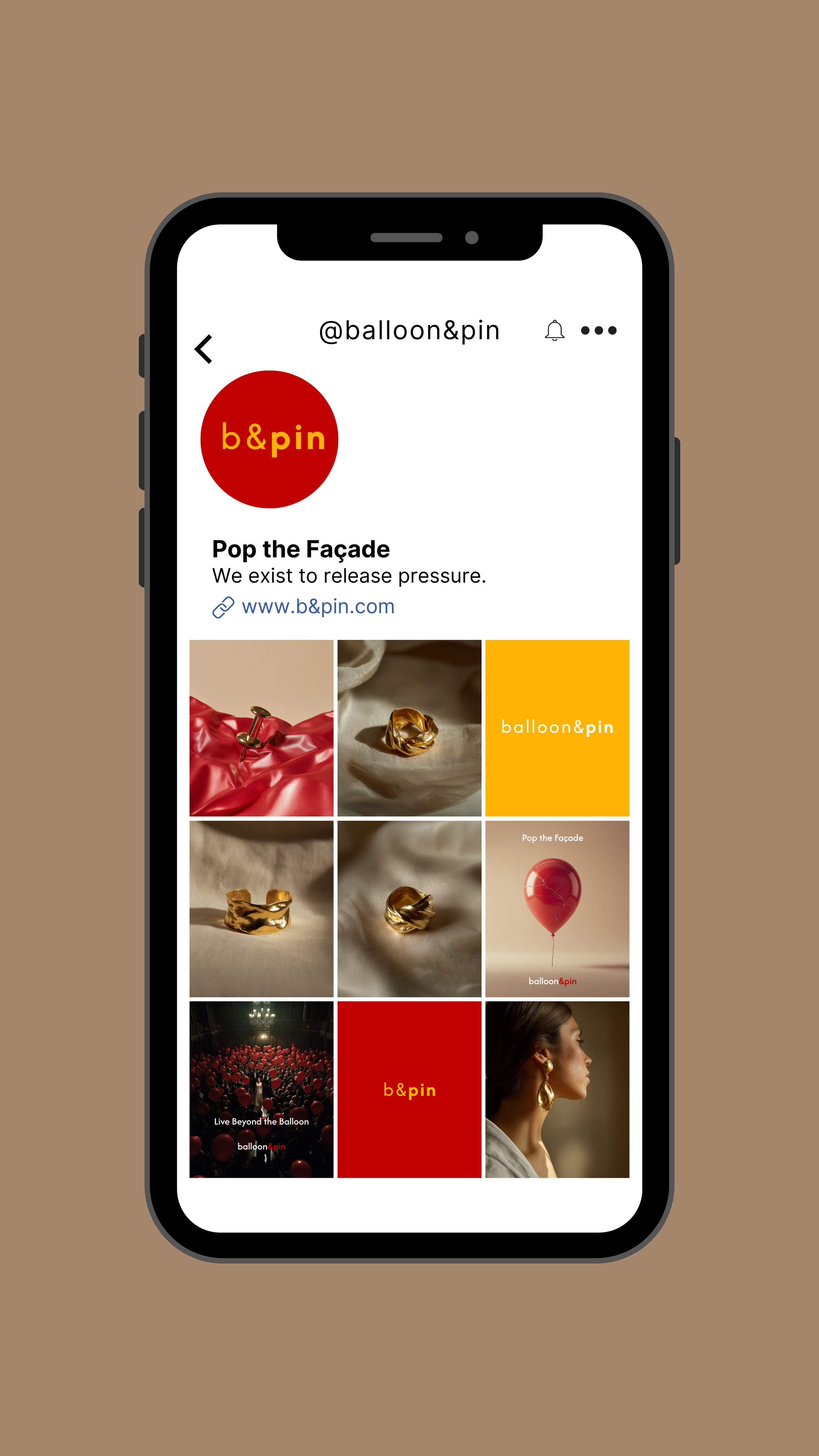
Balloon & Pin
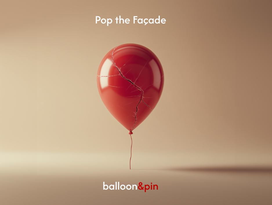
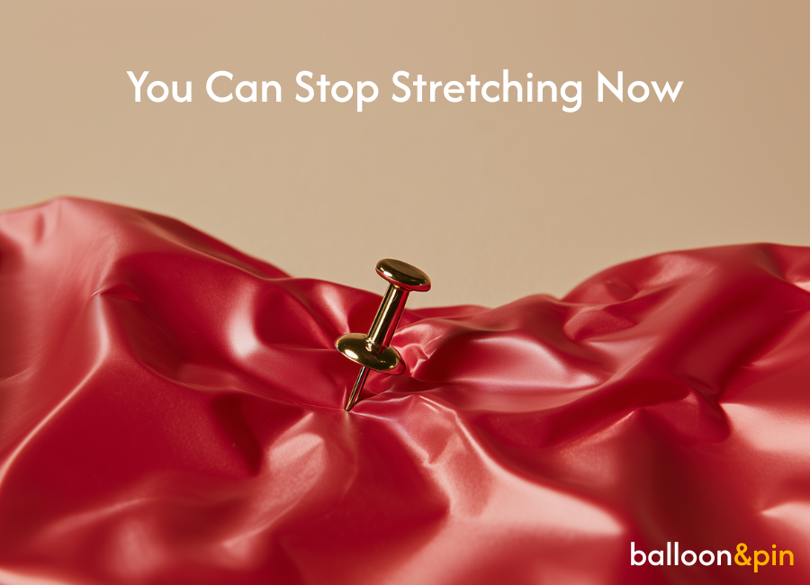
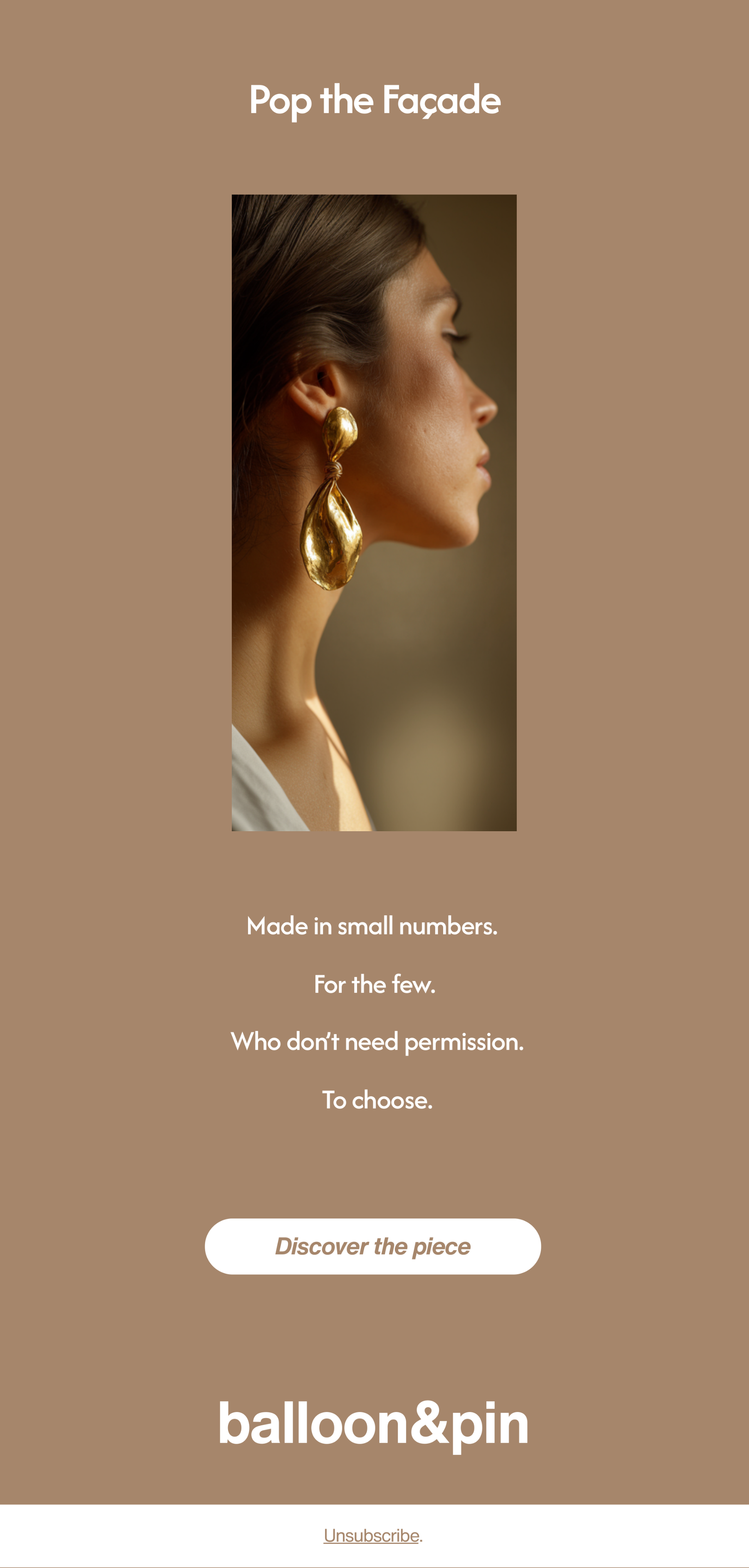
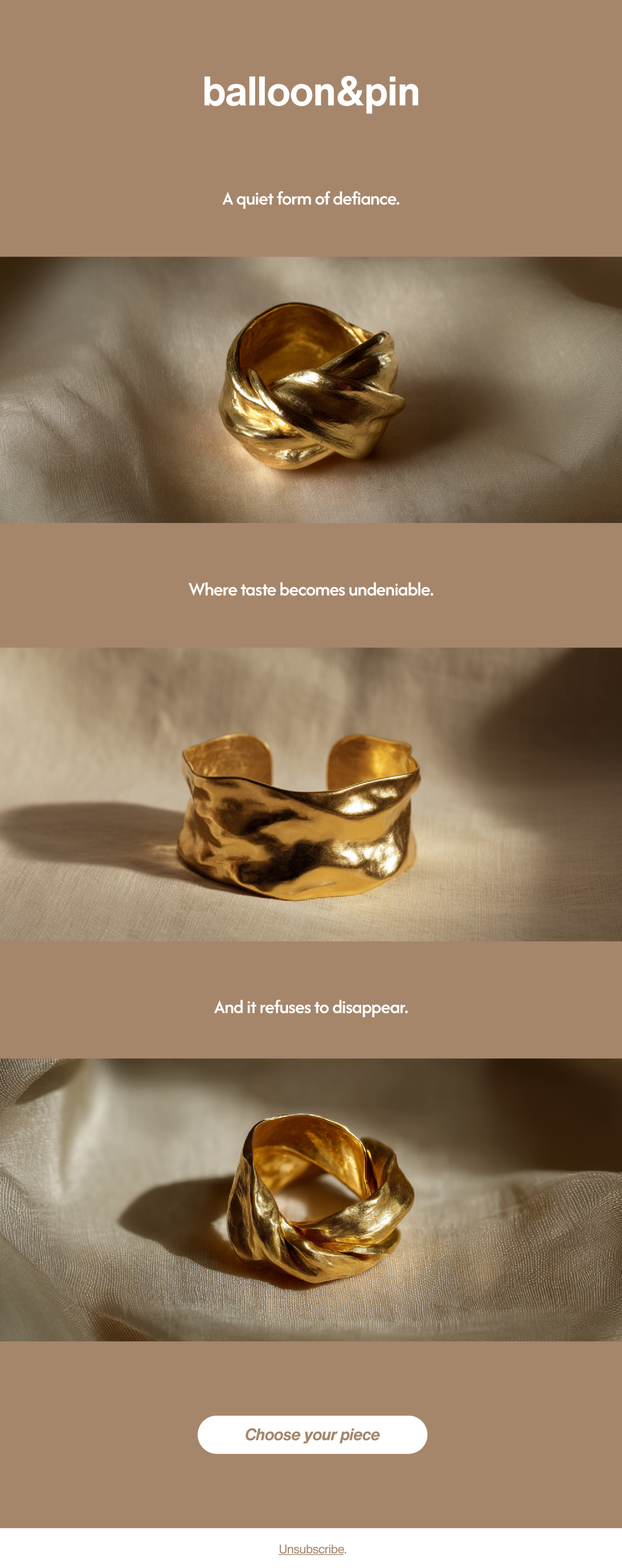
A jewelry brand built around a simple idea: the world stretches us thin. Expectations, roles, and appearances pull like a balloon under pressure. Balloon & Pin creates pieces that symbolically pop that tension, reminding the wearer to return to their own shape instead of the one society inflates around them.
Challenge
The jewelry space is crowded with brands that prioritize surface over substance.
Visual identities often blend together into the same neutral luxury template, even as people crave meaning.
Balloon & Pin needs direction that transforms its philosophy into a system you can feel, wear, and understand without explanation.
-
Before.
-

After.
Creative direction
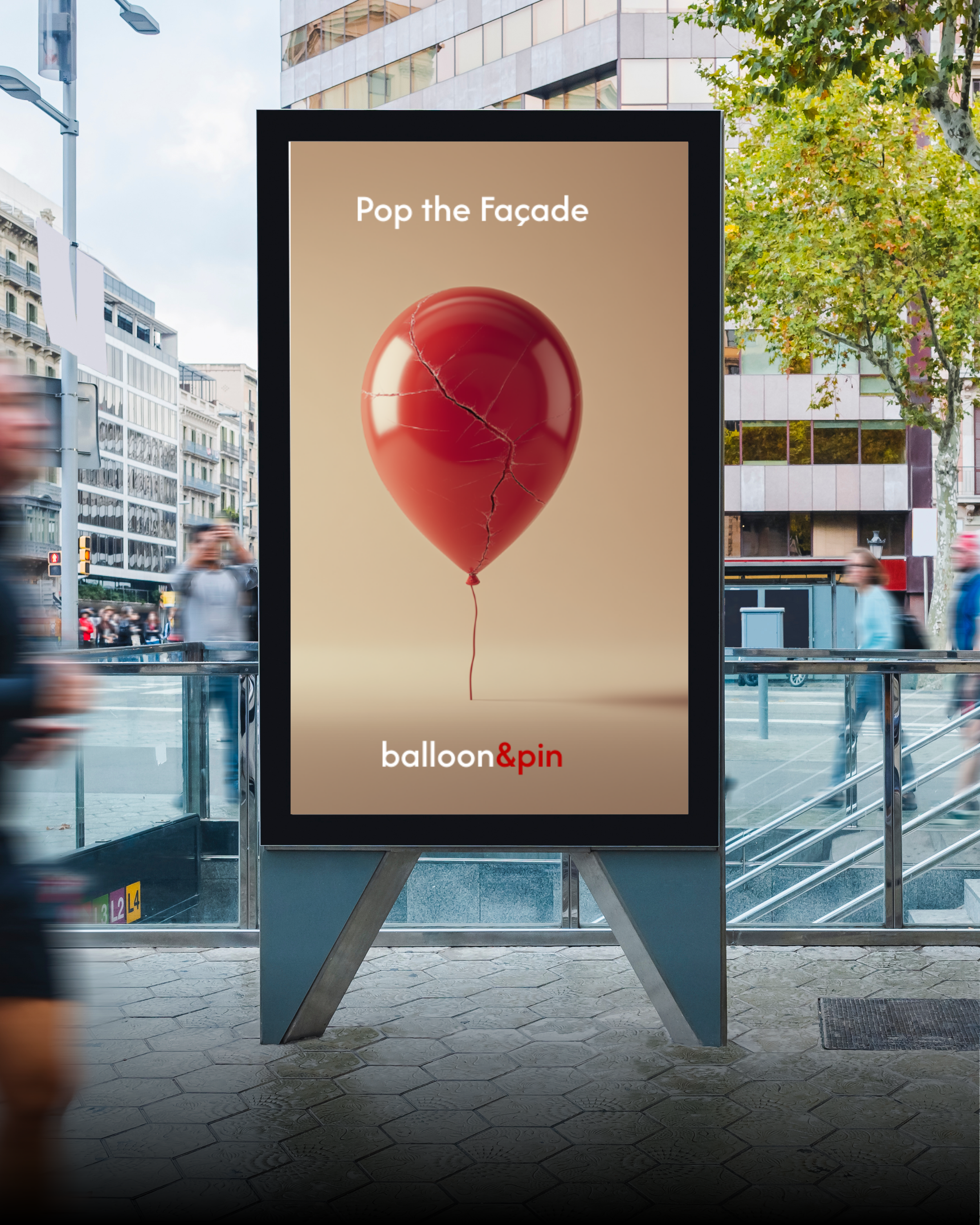
Balloon & Pin exists to release pressure. Each piece embodies the moment a balloon lets go of its forced shape. Nothing forced, nothing inflated. Just form returning to honesty. The brand celebrates people who choose their own outline instead of the one assigned to them.
Visual world
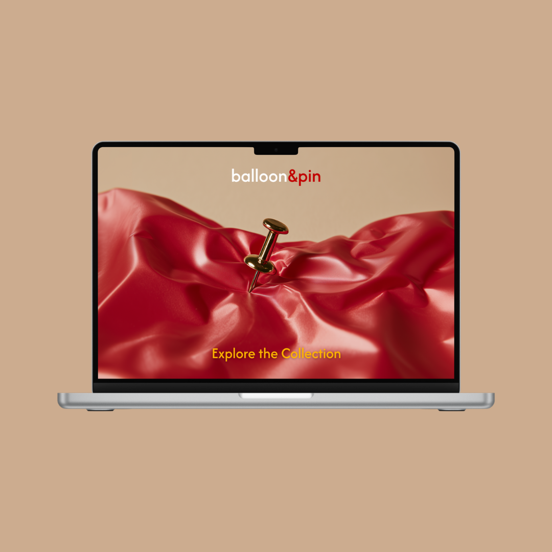
Imperfect elegance: matte metals, softened edges, textural shadows, and balloon folds translated into wearable geometry.
A grounded palette of metallics and off-whites, with one accent hue held in reserve for emotional emphasis.
Photography that feels intimate and tactile, highlighting creases, pressure marks, and lived-in material depth.
Graphic cues reflecting pressure and release: stretched text forms, pin-like lines, quiet distortions, and popped or torn edge details.
Tone of voice
Minimal, honest, and direct, speaking with emotional certainty rather than adornment.
Vocabulary anchored in tension, truth, release, shape, and presence.
Rejects trend language or glittery charm; prefers statements that feel like realizations.
Always ties the product back to the philosophy: jewelry as a state of mind.
-

#C10100
-

#FFB300
-

#FEF9EE
Font: Afacad
Marketing & Growth Approach
Target audiences: people seeking symbolic, emotionally charged accessories; minimalists; creatives; anyone rejecting performative aesthetics.
Acquisition: Instagram editorial grids, artist collaborations, story-driven short videos, and philosophy-first messaging.
Launch phases:
Tease: short cryptic lines (“You can stop stretching now”) with balloon-form visuals.
Launch: reveal the brand philosophy, first collection, and the deflated-balloon designs.
Sustain: spotlight real users and how they interpret “release” in their own lives.
Flagship campaign: “Pop the Façade,” turning tension and release into a visual transformation across social and print.
Repurpose loop: close-ups, philosophy lines, motion stills, and behind-the-design notes woven into a consistent grid.
Testing: try variations in message framing (philosophical vs. tactile), color pops, and product scales.


Brand Applications
Selected email work
Performance Outlook
• 8–12% Instagram engagement rate driven by concept-led visual storytelling and tactile product photography.
• 3.5–5% click-through rate on paid social campaigns introducing the “release the pressure” brand narrative.
• 5–7x content share rate compared to standard jewelry product posts due to the symbolic storytelling framework.
• 15–20% save rate on carousel posts explaining the philosophy behind each piece.
• 25–35% returning visitor rate on the landing experience driven by narrative-led product discovery.
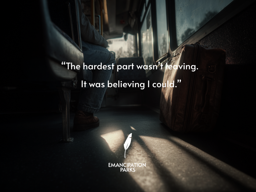
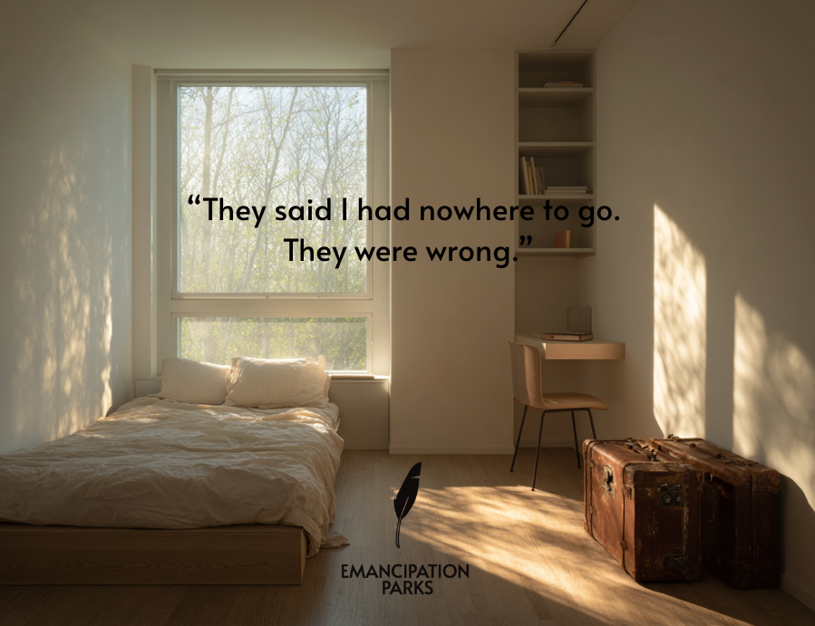
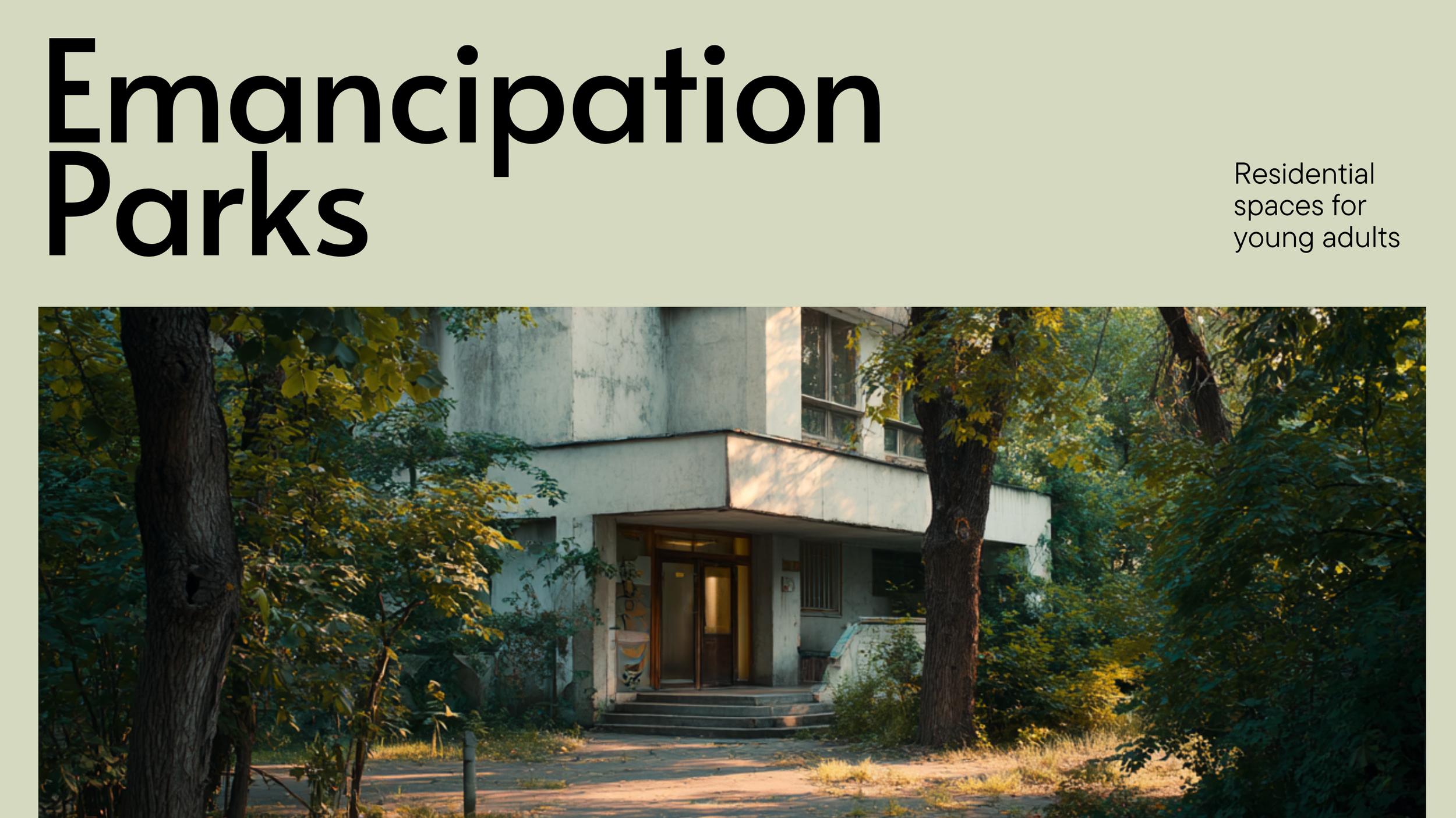
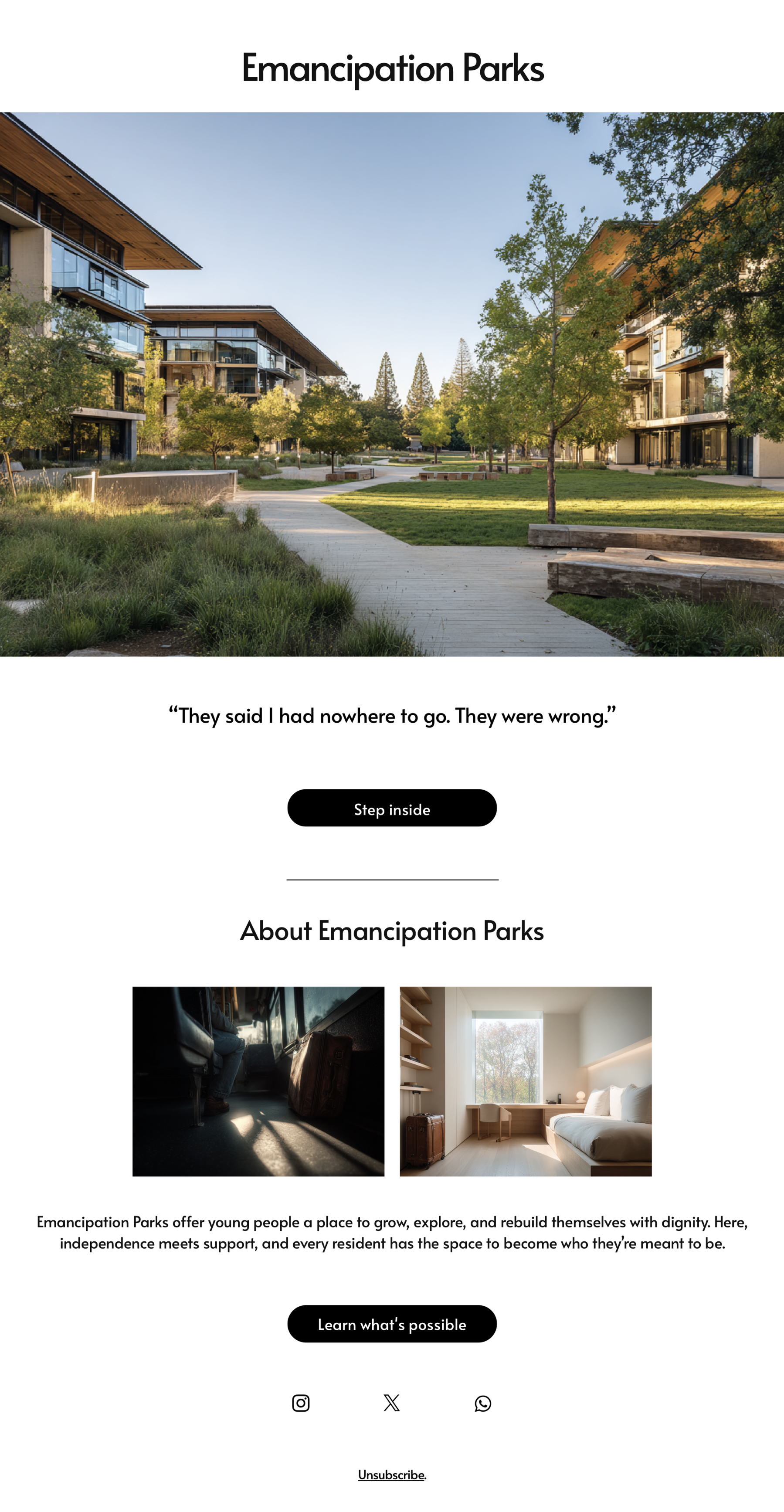
Emancipation Parks
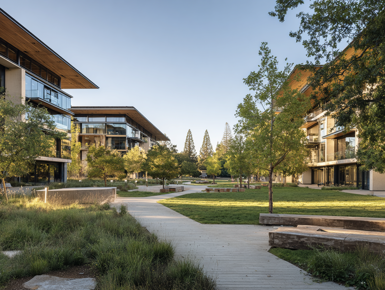
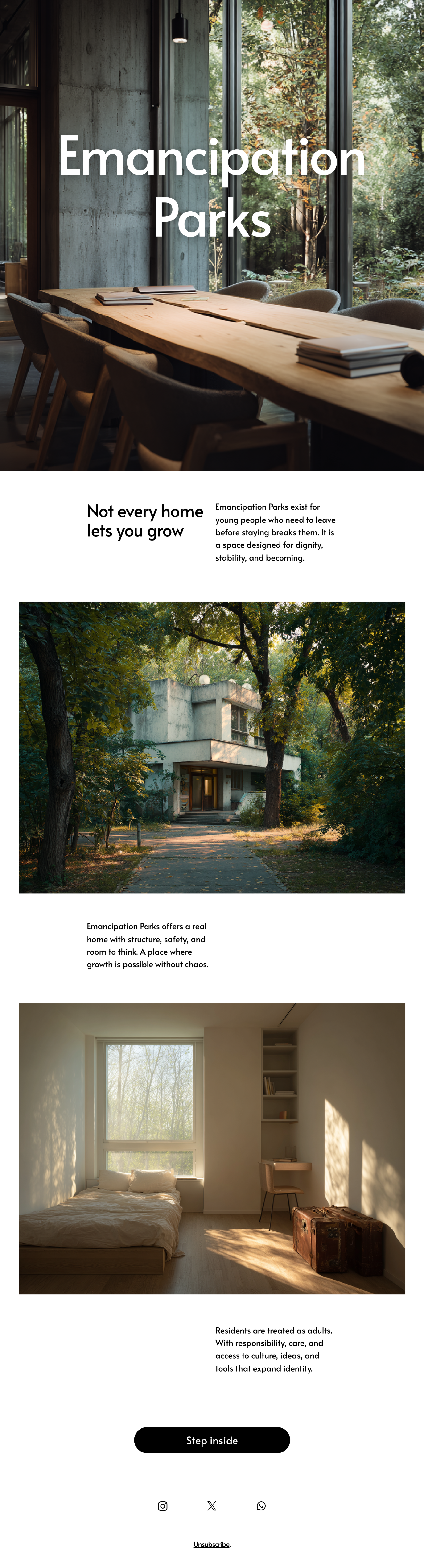
A new kind of home for young people who need to leave before home breaks them. Emancipation Parks create intentional living spaces where 18 to 21 year olds can step out of damaging environments without falling into homelessness or chaos. These spaces give structure, safety, and cultural nourishment so residents can rebuild themselves with dignity.
Challenge
Young people who leave dysfunctional homes face a false choice: stay and shrink, or escape into instability.
Existing systems only respond to crisis. If you are not abused, addicted, or homeless, you are left without support.
Most youth programs offer supervision, not liberation. They manage behavior instead of developing inner strength.

Font: Alata
Creative direction
Emancipation Parks exist to make growth possible. They offer a real home, not a shelter. Residents get room to breathe, space to think, and exposure to the ideas, art, and tools that expand identity. This is not about rescue. It is about building a self that was never allowed to emerge at home.
Visual world
A calm, honest environment: soft neutrals, natural textures, large open rooms, architectural stillness.
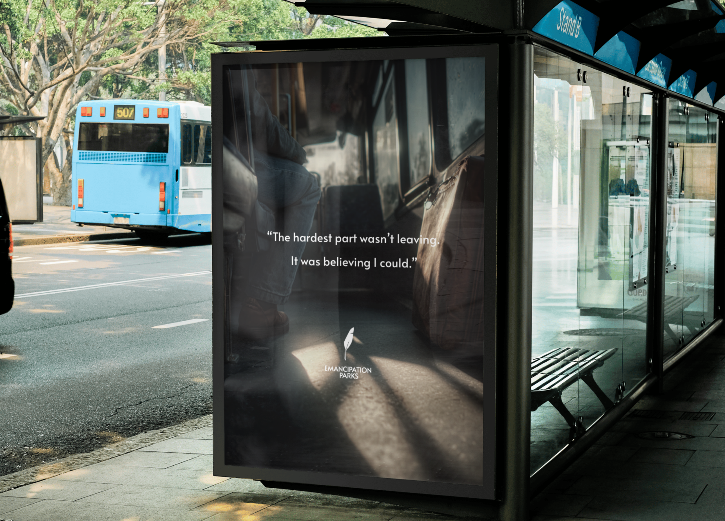
Photography that feels observational rather than staged. Real faces. Quiet moments. Light moving through space.
Symbols of autonomy: open doors, notebooks, headphones, beds that are made with care, hands holding books or sketchpads.
A visual rhythm of growth: morning light, long corridors, framed silhouettes, intentional quiet.
Tone of voice
Direct, steady, and protective.
Speaks to residents as adults, not as cases or troubled youth.
Names emotion without dramatizing it: pressure, coherence, independence, rebuilding.
Focused on agency, not crisis.


Marketing & Growth Approach
Target audience: young adults who feel trapped at home but do not fit the definitions used by shelters or state programs.
Partners: artists, entrepreneurs, and mentors who were once these kids and can speak with authority and lived truth.
Launch phases:
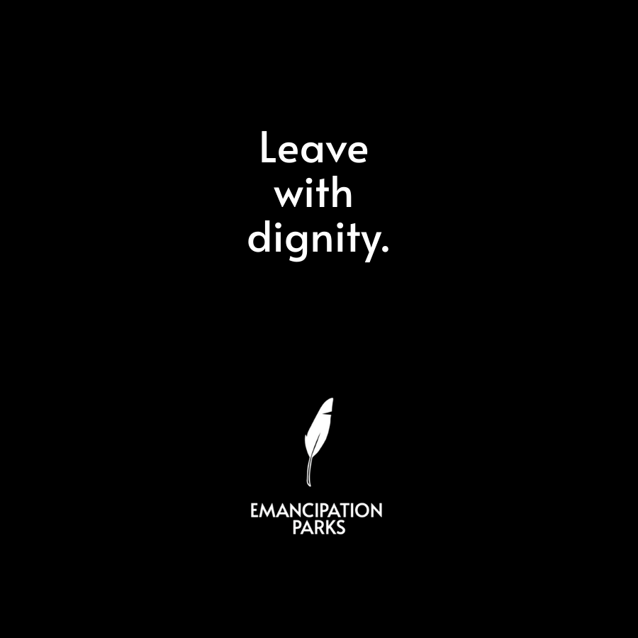
Tease: powerful statements about leaving with dignity.
Launch: documentary style visuals inside the first center.
Sustain: real resident stories on growth, art, and becoming.
Flagship message: Leaving is not failure. Leaving can be the beginning.
Content loop: resident projects, creative work, community moments, and educational artifacts feed a consistent narrative of transformation.
Brand Applications
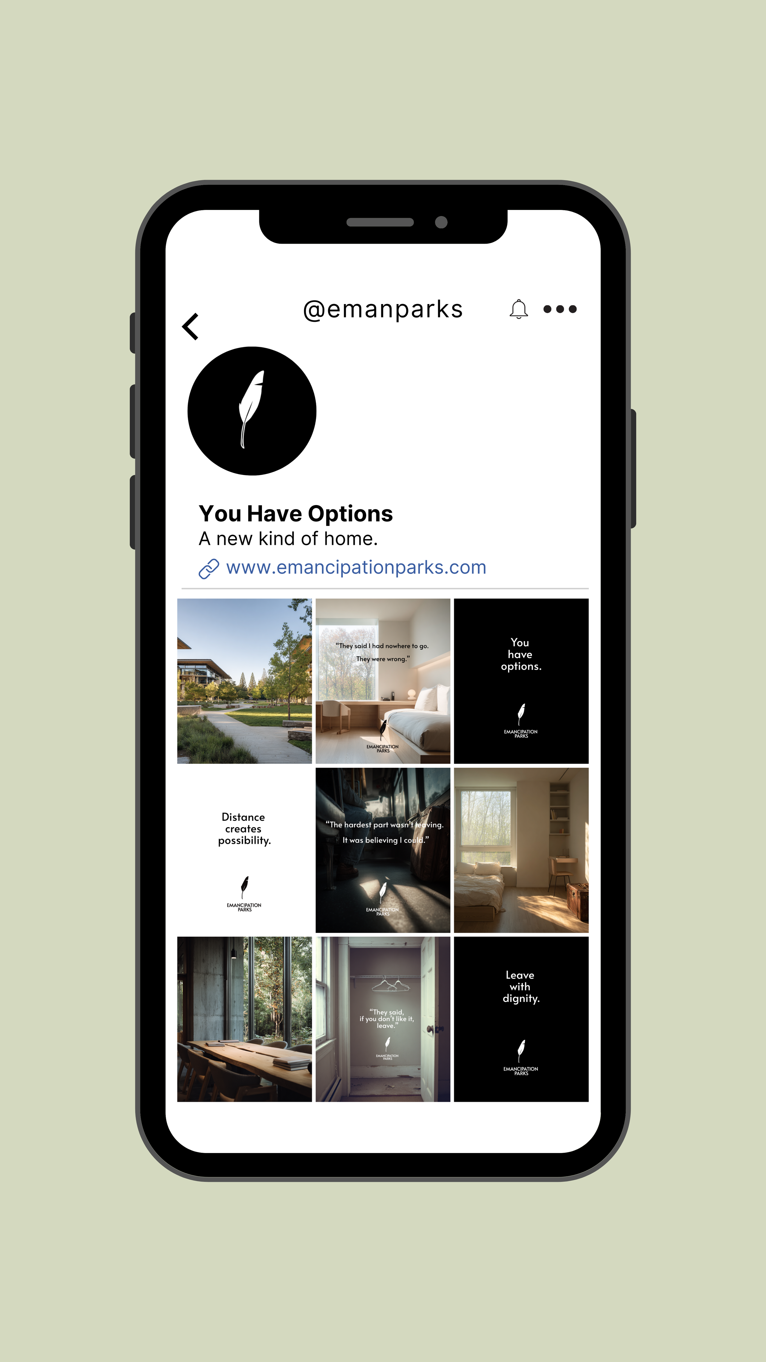
Selected email work
Performance Outlook
• 50–70% higher engagement rates than traditional nonprofit messaging by framing independence as growth rather than crisis.
• 3× stronger share rates through quote-driven campaign visuals such as “Leaving is not failure. Leaving can be the beginning.”
• 25–40% increase in qualified applications from young adults seeking structured independence programs.
• 15–25 meaningful partnerships with artists, mentors, and cultural figures who extend the message organically.
• A sustained narrative ecosystem, where resident stories, creative work, and community projects continuously feed the content loop and keep the initiative culturally visible.